Pinterest Board - Possible Ideas
For start of this project we were asked to create a pinterest account and pin images that are relevant to the title "Environment" and make a board. Throughout this project we will expand this board and pin more and more images and ideas that will give as inspiration for the future Exam. I decided to use to basic key word, "Urban" and "Derelict" because I really like the mood of the images and i would like to further explore it as in a city as London there are many places especially in north London that would help. After that I created a board with all my pins called 'Environment" and I screenshoted it and saved it as images to upload them.
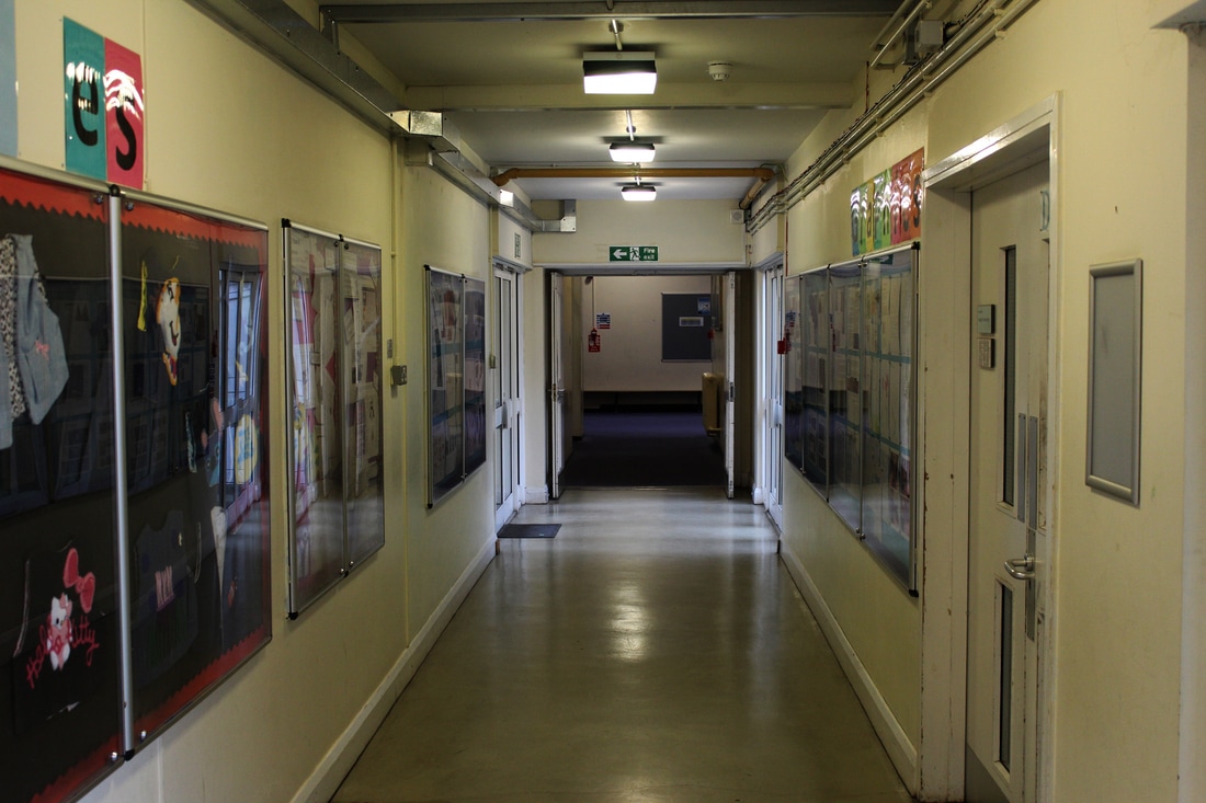
Public Places
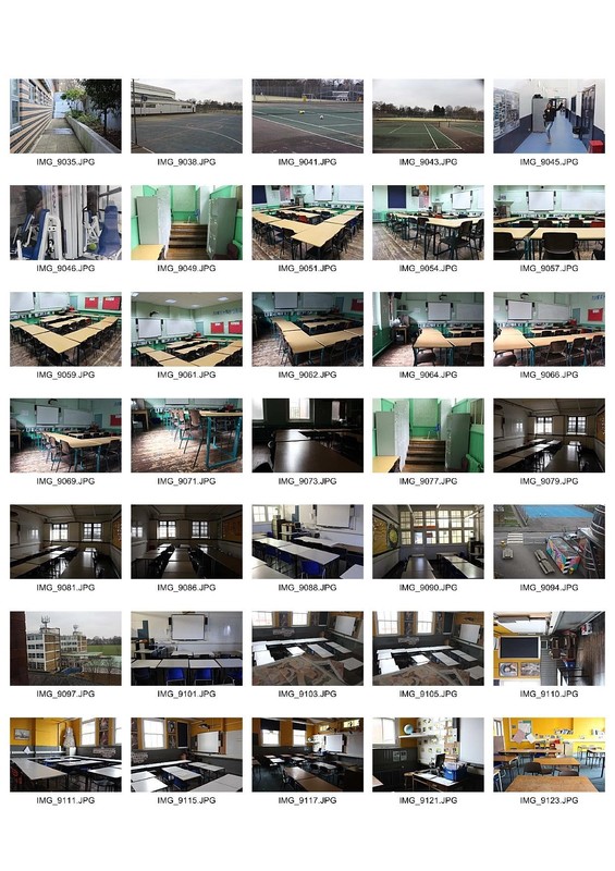
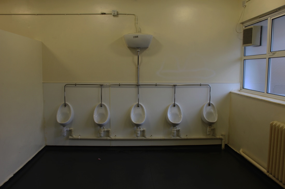
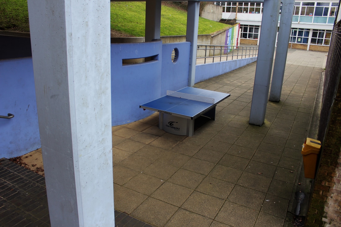
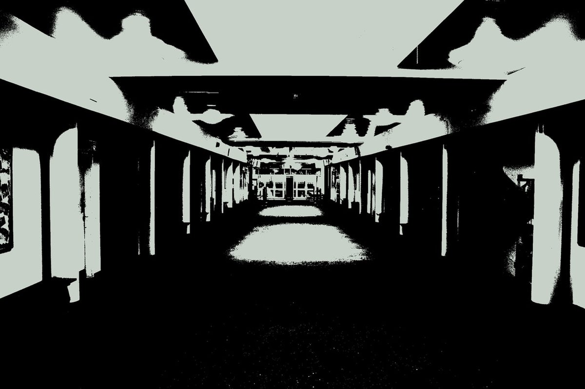
The aim of this task is to go around the school and photograph empty spaces, varying from toilets, hallways, classrooms, playground and more. I photographed during school time empty spaces who although usually are full with students, now the feel redundant due to the lack of human existence. The feel of emptiness and dereliction of these places which at other times are full with people, is what I try to achieve using a high aperture and slow shutter speed. The sky which was dark and cloudy was a main factor which helped create darker images, something that enhances the feeling of negligence and ruin.
|
|
|
I mainly photographed North Wing, Tetherdown, the Sports Center, the Music Hall and the spaces between these buildings. I tried to photograph from different angles and perspective, classrooms, toilets, hallways, the canteen and other places.
|
|
WWW: I feel that my images pretty much depict dereliction and emptiness in a crowded and public place such as a school. I like the lighting and shadows created in some of my images and the angle I shot in the boys toilets. I also think the wide angle I used for most of my images capture an extensive part of the space around me, showing in detail how a public place looks when there is no one in it.
EBI: What I could improve about this set is to have tried to capture more in detail images, showing the texture and the layout of objects around these public places. I could try to come closer to my object and photograph it from different angles. Also I think I should have come later on the day after school when it is darker and the spaces feel more empty and abandoned.
EBI: What I could improve about this set is to have tried to capture more in detail images, showing the texture and the layout of objects around these public places. I could try to come closer to my object and photograph it from different angles. Also I think I should have come later on the day after school when it is darker and the spaces feel more empty and abandoned.
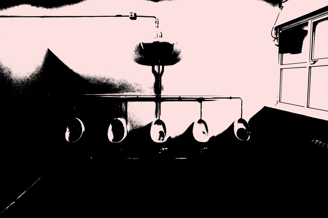
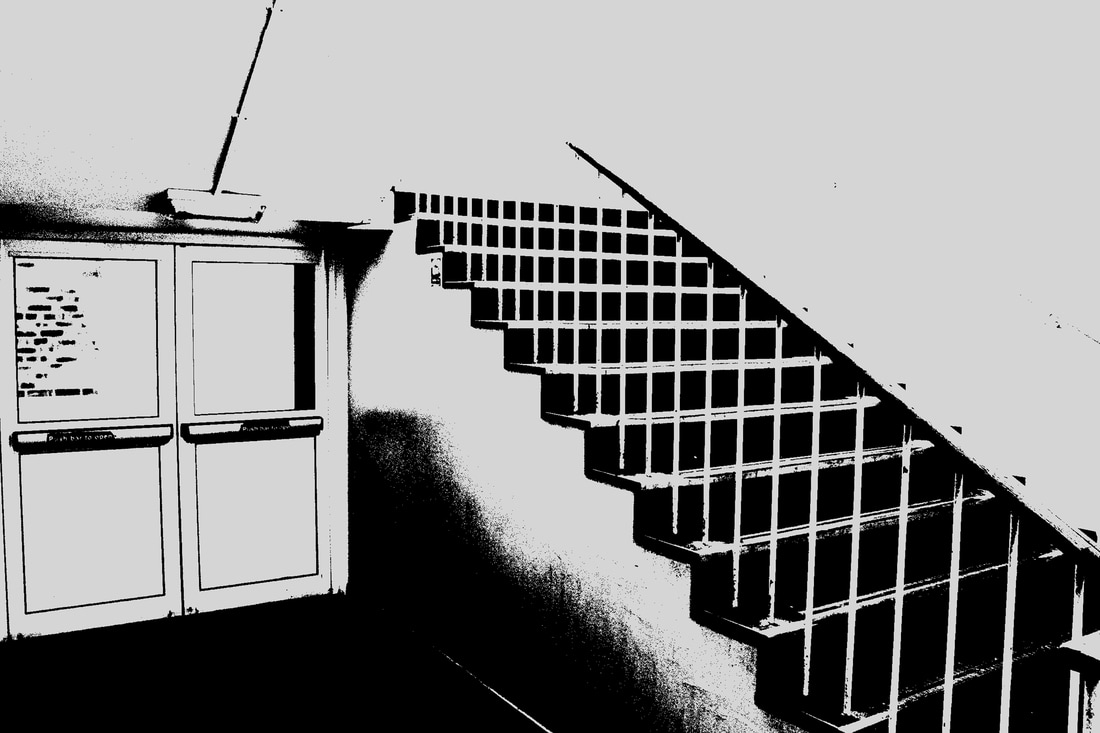
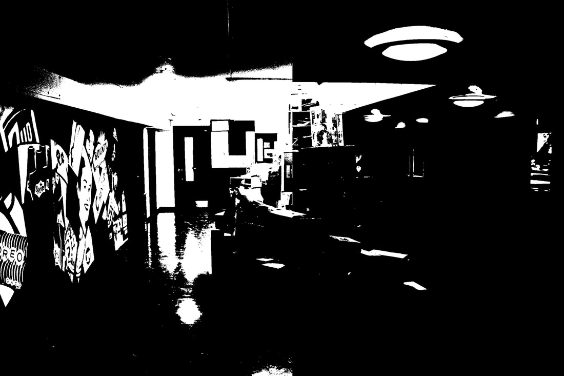
Development - Empty Public Spaces
For my development on empty public spaces, I continued documenting empty spaces around London. Every time I would do another task I tried to find a chance to take a picture of public space, that was or felt empty. These are my favorite selected images, which I then further processed in Photoshop to give them a bit darker tone and change the lightness and exposure.
Development 1: High Contrast
Artist - Keld Helmer-Peterson
|
|
Keld Helmer-Peterson (1920-2013) is a famous Danish photographer and a pioneer of Danish modernist photography. He started taking photographs in the late 1930s and and was introduced to the word of photographers with his body of work named 122 Colour Photographs in 1948. He became famous for his innovative use of colour in well composed images of pattern with landscapes and buildings. Two decades later Helmer-Peterson he became more widely known for his photographs of architecture and design. At the same time his work shifted to the more abstract nature of photography, inspired by German and American abstract photography. He has been recipient of four awards and has curated eight exhibitions throughout his career.Black Noise, the project created by Helmer-Paterson which is relevant to the theme title, features a collection of high contrast abstract images take by Helmer during the 1960s. The collection was published in the form of a book by the Rocket Gallery and consists of flatbed and negative scans of black and white objects and things from ink drawings, to dead spider, plants and supermarket receipts. In many of the photographs Helmer-Petersen has adjusted the contrast to create stark, purely black and white images.
|
Edited
Continuing on with the set of task I developed the images for the previous task. I uploaded the images I selected in Photoshop and then I went to Adjustments
-> Threshold to get this effect. Then depending on the image and the light areas and shadows I change the threshold level. To finish off I add a coloour filter to make my image more artistic.
-> Threshold to get this effect. Then depending on the image and the light areas and shadows I change the threshold level. To finish off I add a coloour filter to make my image more artistic.
|
|
I feel that my interpretation to the artist work approaches a less abstract form. Through the dark black and white images I tried to make my scene seem even more isolated and abandoned. I really like the result as this process tones the edges of the image and let only the important information to be seen leaving the basic form in clear contact with the viewer. At the same time it approaches the abstract and with the use of colour filter I tried to make it look more funky style.
Development 3 : Dissect
Patrick Cornillet is a French artist who paints flinty constructions of dark tones, in empty environments. These complex paintings try to make the spectator follow their complicated structure, playing with the minds of the viewers. Although they seem like actual images due to the realistic form, they are indeed paintings. We could say that the seem like actual buildings of which parts of them have been erased, but not the important leaving the basic 'concrete' structure untouched, and removing every living elements on them. The dark and not colourful shades he chooses to use create a moody tone, and a feeling of movement is created to the viewer at a second view. Because the structures are drawn like they are on an actual specific angle it seems like they can give an idea of their dimensions, but due to the lack of background environment it is fairly impossible to give an exact estimation of their proportions. They are "timeless" and "infinite" according to Cornillet. 'This sensation, both familiar and strange, strengthens the feeling of alienation one has when confronted to the works. Balancing between the two, these images evoke the ruins of a fallen society or perhaps the threatening vision of a near future. They stand naked, as fragmented skeletons, deprived of their initial content but they keep their special mystique intact.'
Patrick Cornillet
For this development we had cut and erase essential parts of the originals. I decided to use images from previous shootings which I did not have the chance to use before, which I had taken either in Southbank or in Berlin but due to their minimalist architecture. I chose them because of the brutalist architecture of the buildings and the raw concrete walls. I felt that these mages they would fit this development more than the images I took in the school. So after I chose my images, I edited them In Photoshop leaving only the part with buildings and concrete removing any natural or leaving element, and also decreased the hue and saturation to make them more achromatic and brutal.
Half Term - Homework
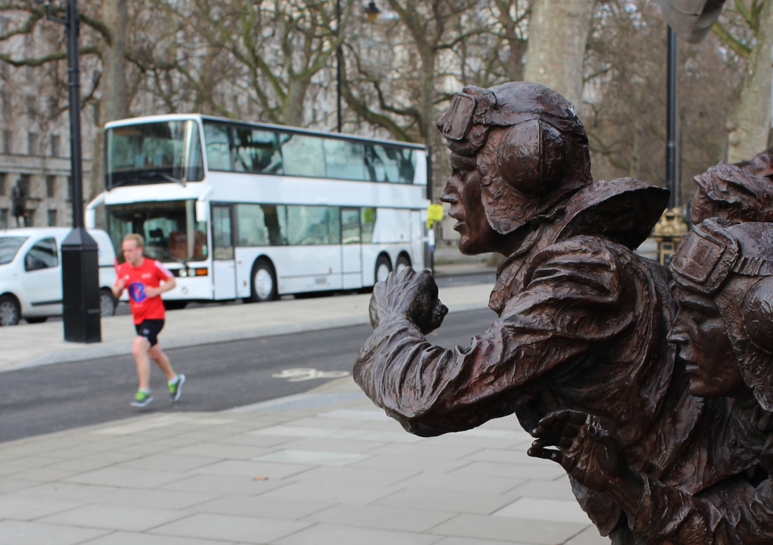
Task 1: Perspective
I did this task the same day as the "Back of People" task in central London. I tried to experiment, photographing from different angles, looking either up or down. I took pictures of people, statues and objects form a different perspective than the usual one we see them everyday. The first two images I took them from the balcony in Tate Modern looking down to passengers, entering and exiting the gallery. I really like the image on the right because there are only two people and at the right corner. I also find the image with the soldier memorial on the front and the running man at the blurred man in the background.
|
|
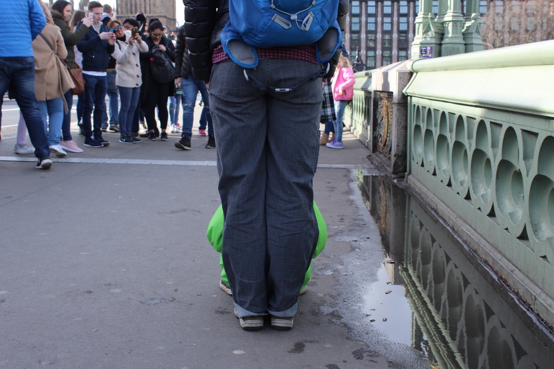
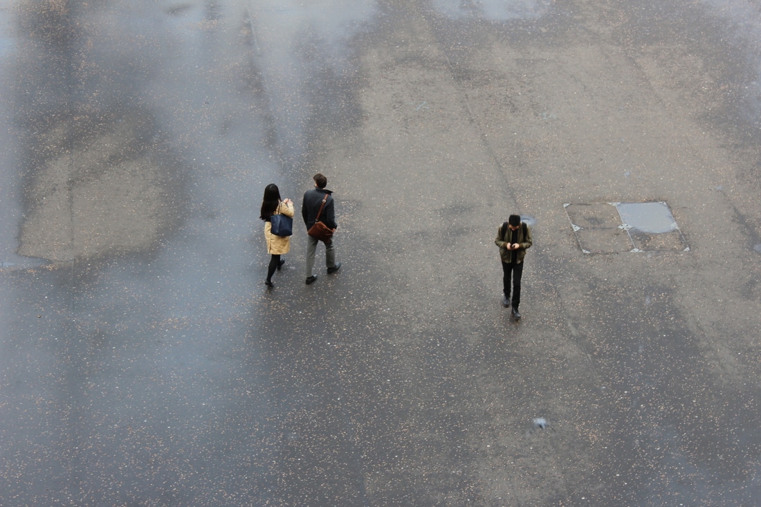
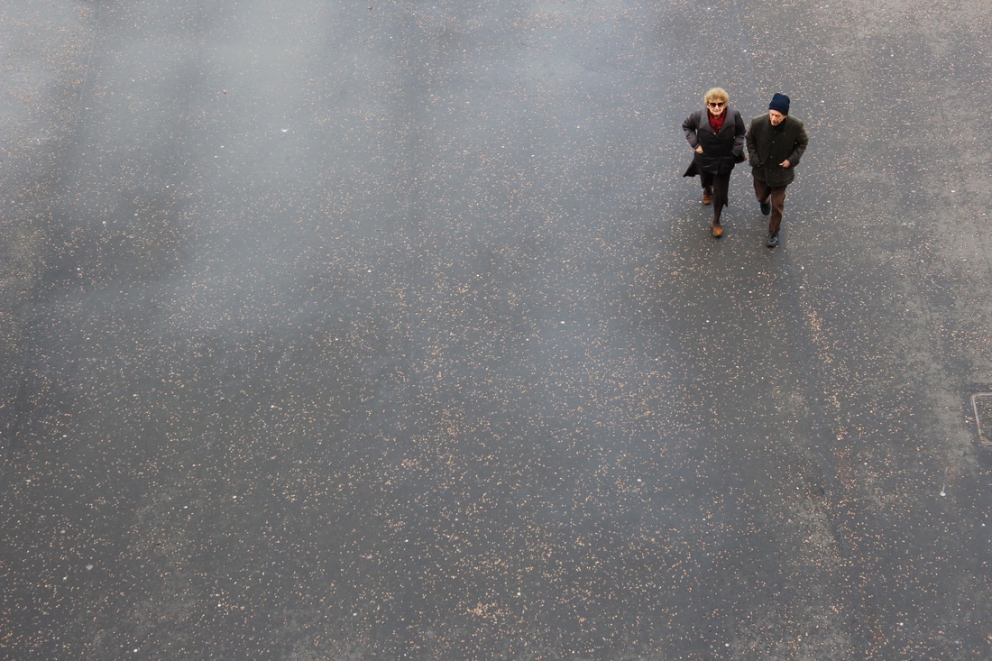
Task 2: Back of People-What are they looking at ?
|
For this task I tried to find chances to take images of the backs of people photographing, them and the scene in front them. I found this very interesting as each image reveals the different things each person does in a metropolitan city such as London. I tried reveal the scenery that lies in front of each person because 'what our eyes see is a reflection of us'. From inside a gallery till the back of the mascot of Cool Britannia in Piccadilly Circus, I tried to reflect the everyday life of people. I think the different images are interesting in context experimenting with a different angle rather than the usual frontal, which most people use, and tried to capture this without asking them to pose, as I think that would give a better and more realistic idea of the theme. In some images I tried to come closer to the persons back and capture what he or she was looking but in other occasions I felt that by looking them as a whole part of the image with the background would be necessary to reveal about what they were looking at and to be able to be more recognizable by the viewer.
|
Task 3: Tate Exhibition-Wolfgang Tillmans
Wolfgang Tillmans has earned recognition as one of the most exciting and innovative artists working today. Tate Modern presents an exhibition concentrating on his production across different media since 2003. First rising to prominence in the 1990s for his photographs of everyday life and contemporary culture, Tillmans has gone on to work in an ever greater variety of media and has taken an increasingly innovative approach to staging exhibitions. Tate Modern brings this variety to the fore, offering a new focus on his photographs, video, digital slide projections, publications, curatorial projects and recorded music.
|
|
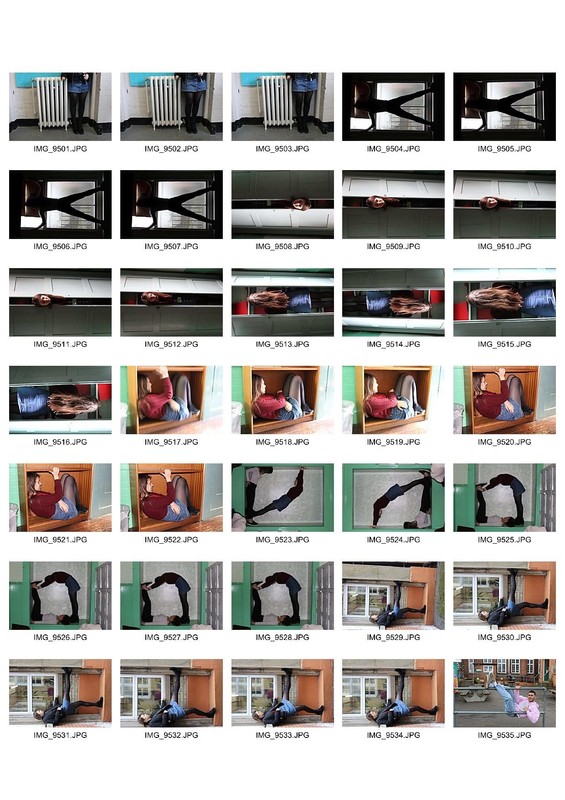
Body in Space
Artist Link - Willi Dorner
“Bodies in urban spaces” is a temporarily intervention in diversified urban architectonical environment. The intention of “bodies in urban spaces” is to point out the urban functional structure and to uncover the restricted movement possibilities and behaviour as well as rules and limitations. By placing the bodies in selected spots the interventions provoke a thinking process and produce irritation. Passers by, residents and audience are motivated and prompted to reflect their urban surrounding and there own movement behaviour and habits. “Bodies in urban spaces” invites the residents to walk their own city thus establishing a stronger relationship to their neighbourhood, district and town. The interventions are temporarily without leaving any traces behind, but imprints in the eye-witnesses` memory. “bodies in urban spaces” is a moving trail, choreographed for a group of dancers. The performers lead the audience through selected parts of public and semi-public spaces. A chain of physical interventions set up very quickly and only existing temporarily, allows the viewer to perceive the same space or place in a new and different way - on the run. The special quality of each place at various times of the day creates unique presentations. - Willi Dorner, 2007
|
|
|
My Response:
In response to Willi Dorner body of work under the title "Bodies in urban spaces". I photographed two other classmates around the school. We tried to create different poses and squeeze in small and uncomfortable spaces. The models do not look straight to the camera as the purpose is not to reveal their face and expressions but to present how the body fits with its environment around it. In Dorner's project the models wear all similar and colourful clothes with hoodies preventing their faces to be exposes as he wants them to use as one 'mass" in the environment. Although it was difficult to make poses and squeeze into places such as Dorner's models we tried to take interesting poses and experiment with the environment we were, at each time and show how this reflects our movements and actions.
|
|
|
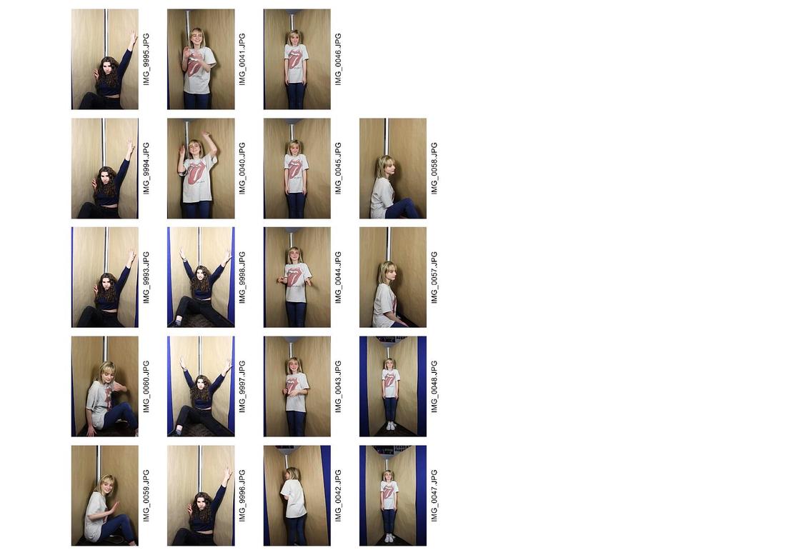
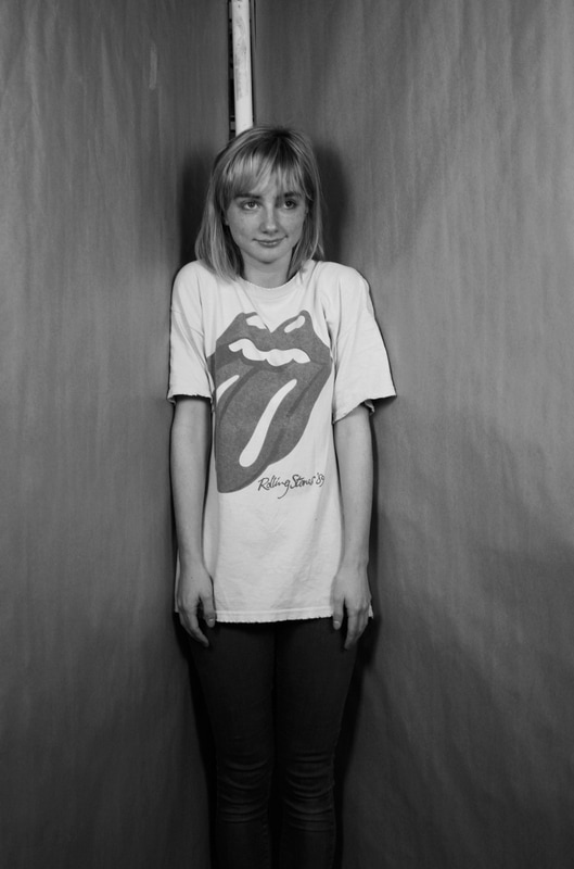
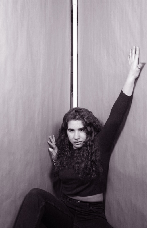
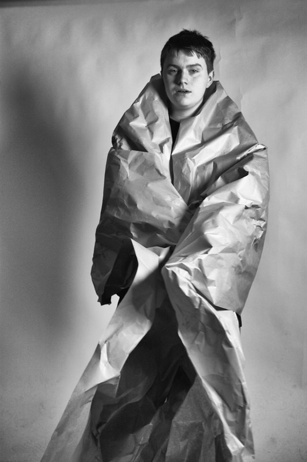
Confined Spaces - Corner - Irving Penn
|
One of the most creative and famous fashion magazine photographers of 20th century, Irving Penn created these rather unusual portraits around 1948. These portraits were not just any other portraits, but a series of portraits picturing musicians, politicians, dancers, artists, writer and other celebrities, in a small corner, sharper than 90°, which was made out of concrete. The photographic studio with the dark and achromatic walls acts as a the neutral environment, and the person each time is left to express themselves as they wish. They might be given a chair or can bring some personal belongings, but just that. Penn wanted to remove every bit of "fame" behind those people and focus only on the human side of them and their reactions and feelings which can be from anxious and claustrophobic till excitement and happiness. These series of images were widely celebrated because they were kind of exposing the everyday and simplistic part of those influential and important people.
As Irving Penn himself says : "Sometime in 1948 I began photographing portraits in a small corner space made of two studio flats pushed together, the floor covered with a piece of old carpeting… a very rich series of pictures resulted. This confinement, surprisingly seemed to comfort people, soothing them. The walls were a surface to lean on or push against. For me the picture possibilities were interesting; limiting the subjects movements seemed to relieve me of part of the problem of holding onto them." |
|
My Response:
In response to Irving Penn's portraits we tried to create the same environment in the lab. We used two plastic walls and wrapped them in brown thick paper, trying to resemble the concrete walls of Penn's images. Then we placed them both in an acute angle together and used different angles and perspectives to photograph our classmates without telling them what to do, but letting them express themselves as they wished. Instead of being claustrophobic and uncomfortable as most people would think they felt, everyone was cheerful and excited. I tried to get as close as I could in order for the edges of the walls not to be seen, but at the same time to keep most part of the body of the model. We experimented with different poses and expressions and the result I think was pretty good. I chose my favourites and cut them in Photoshop to remove the part I did not wanted, and then I turned them in black and white increasing the contrast and exposure changing the tones, in order to give my images a bit more texture and harshness, approaching Irving Penn's body of work.
Contact Sheets:
Contact Sheets:
Edited favourites:
|
|
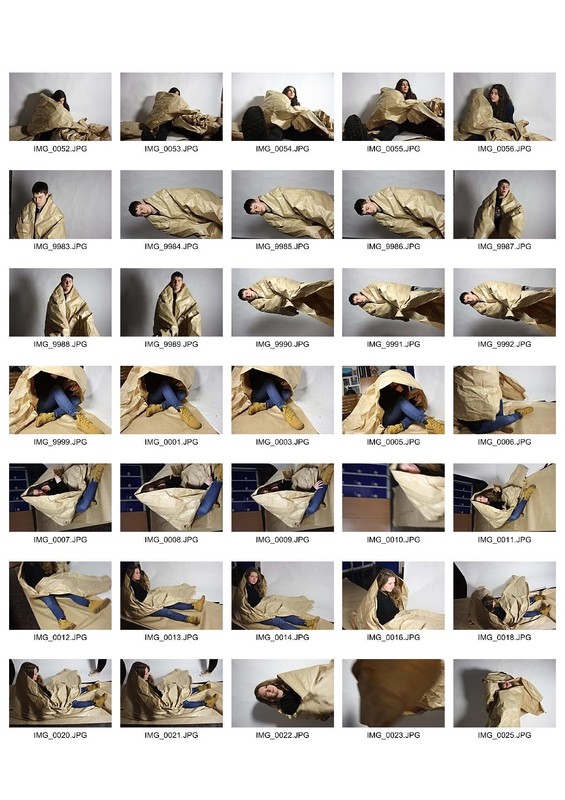
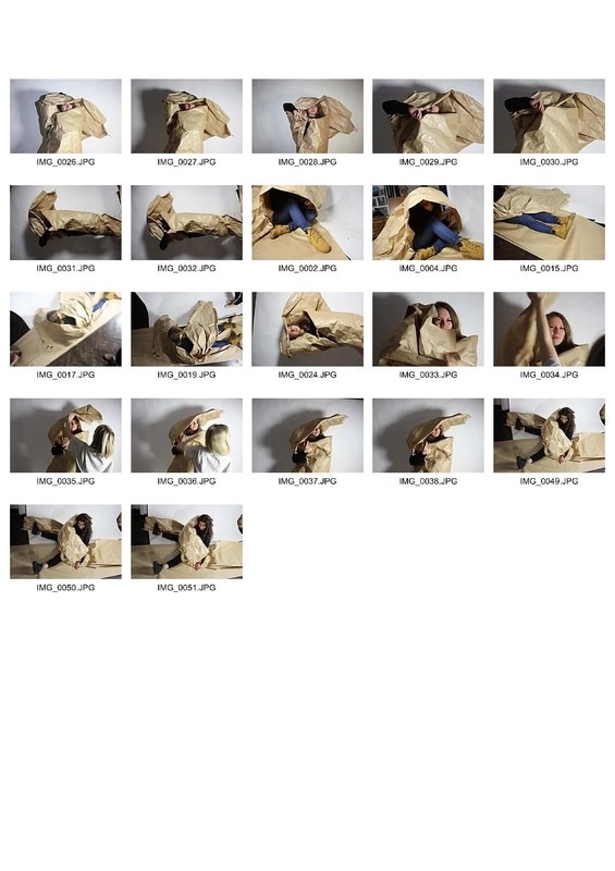
In The Studio
For this task we had to crumble and use a big roll of brown hard paper as we wanted and a model which were other classmates and create portraits. I really enjoyed the process as everyone was involved taking pictures of each other, using lights and white or black background. We tried to create interesting shapes using the paper and the model in a more artistic ways and used the texture and angles of the paper to enhance the abstract form of the portraits. I like the style of the images I chose as they approach the style of magazine-model photography and create the idea of a more apt type of art. After that I created the contact sheets and chose the best ones to process them further in Photoshop. I turned them in black and white as I felt they were much better looking and increased the contrast and tones to make the texture more harsh and add more shadows. The last image which is my favourite I tried to experiment using a silver effect programme which make the images more silver and high dynamic range effect.
Contact Sheets
Contact Sheets
|
|
Edited Favourites
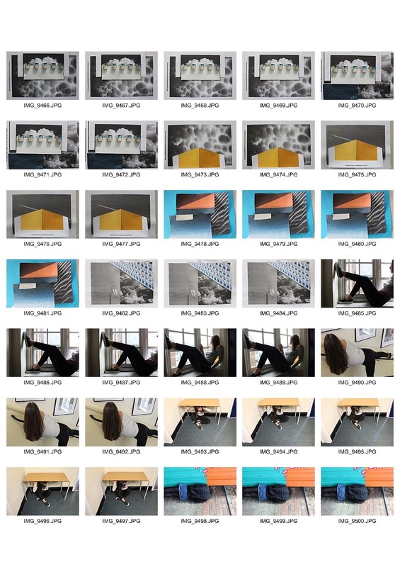
Fake Environments
Artist Link-Aaron Farley
|
Aaron Farley is an American photographer born and raised in the suburbs of Spokane, Washington. He graduated from Washington State University with a BFA in Fine arts. After spending a few years in Portland, he moved to Los Angeles where he currently lives with his wife and children.
Aaron creates this fake and dreamy environments by cutting and merging actual images of skies, clouds, seas and photographing them increasing the depth of field. Although the images look like real environments, just out of focus. the artist "plays" with the views minds to create and illusion. I really like the colours and combination of images he chooses to photograph together and the mood and tone he creates is what make these images more surreal and out of reality. |
|
My Response:
For my response I printed different images of various themes such as sea, clouds, sky, minimalist buildings and cut them and crumble them to create these "fake" environments. I created multi-layer prints and photographed them from different angles changing the depth of field each time. I used colourful images in comparison to Farley and then processed them in Photoshop to enhance them. I really liked the result as I feel it approaches contextually the artist's body of work but at the same time working as a reflection of my preferences in style and colours.
Info about Depth of field and How to Achieve it :
The primary control of depth of field is the aperture, or f-stop, setting on your camera. Smaller f-stops, such as f/4, will allow faster shutter speeds and produce images with shallower depths of field. Focal length can also effect depth of field. The higher the magnification factor (eg 300mm), the smaller the depth of field will be, even with large f-stop settings. Much like lens strength, subject distance, plays a big part in determining the possible depth of field in an image. The closer you are to your focal point or subject, the less depth of field is possible.
|
|
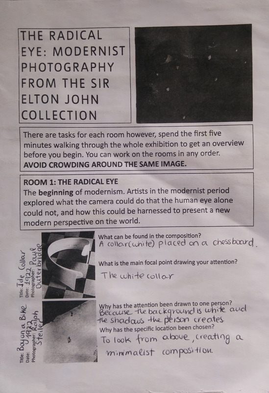
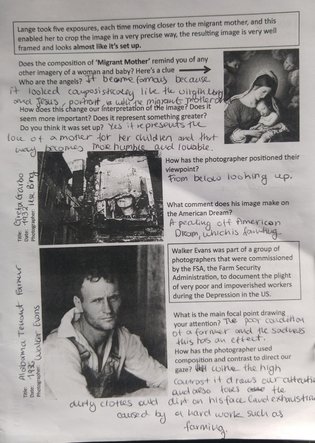
THE RADICAL EYE : Modernist Photography from Sir Elton John
One of our last field trips was in Tate Britain, in the exhibition "Radical Eye" which included framed modernist photography from Sir Elton John's private collection.
|
|
|
Strands
1st Strand
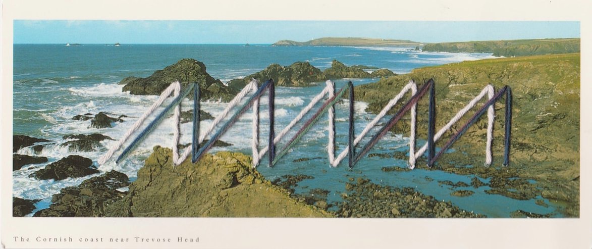
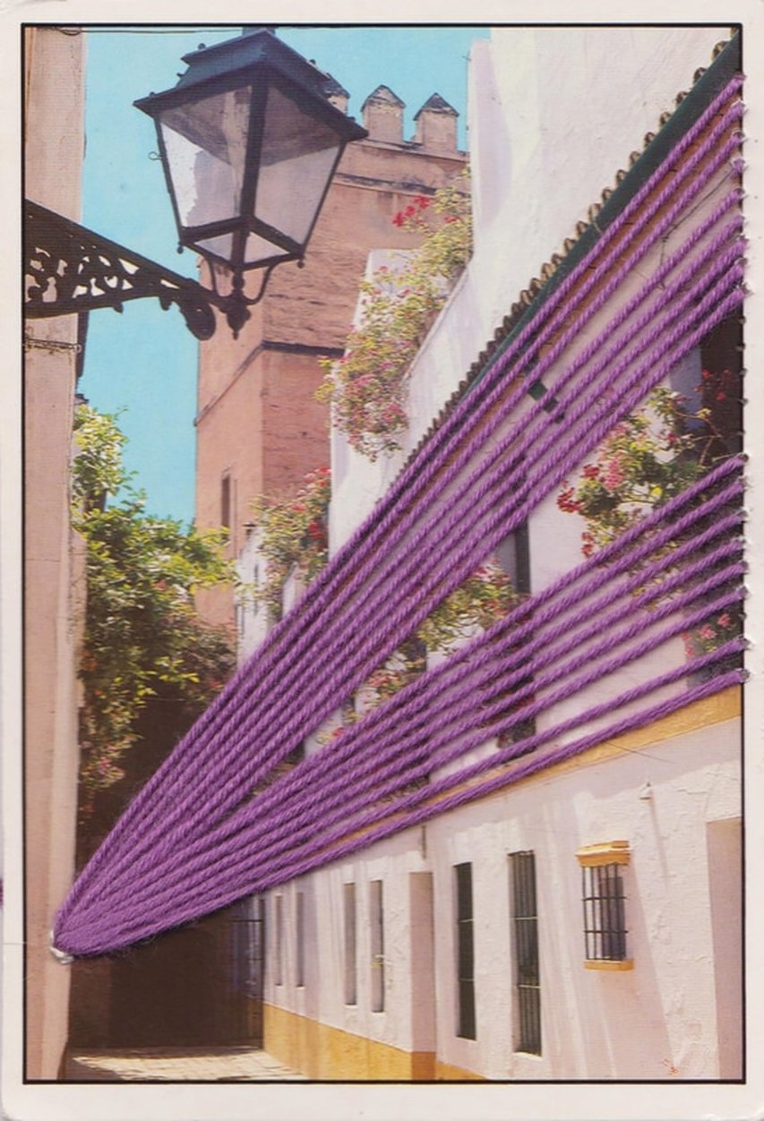
1st: Stiching - Shaun Kardinal
About the Artist : Shaun Cardinal is a Seattle based artist, born in 1982, in Tracy, California. He began making these "little dreamscapes" as he calls them in 2009, and still keeps working on this project, still finding his own style, which changed from rough altered - landscapes to more geometric shapes. Cardinal is also a video producer, a photographer, a sculptor and a musician. Before starting embroidery, Kardinal would exchange small pieces with his friend, and when a friend sent him a hand painted and stichted collage, this acted as an inspiration to take some postcards and stitch them together to make wonderful landscape creations. The combination of embroidery and landscape is what make his work so unique and interesting. The process is very neat and meticulous and Cardinal has to be very precise and careful with the stitching as the paper can easily be destroyed. "The finishing has to be perfect" without any scraps, and the the geometrical and abstract shapes very precise. As it can be seen from the slideshow below, Kardinal's selection of thread colours is not random but it has to much the postcard's colour palette. As Shaun Kardinal says about his work : "Most of the embroidered paper work is an ongoing exercise in aesthetic, consciously avoiding any implications of meaning. On occasion I make attempts to convey meaning and feeling within the abstractions, but in general they are simply about composition and color, and intended as a honing of craft. How this craft may yet be incorporated into other works over time is an exciting proposition to me."
My Response :
I really liked the work of Kardinal and found really interesting the combination of landscape photography and artistic methods such as stitching. I think it links to the theme which is environment. The intentions are to create a harmonic existence of both nature and minimalistic and geometric shapes. As a response I bought postcard from around the are where I live and used thick needles and colourful thread to create interesting shapes. The I scanned them and used Photoshop to alter the brightness and contrast to look better. I selected five of my favourite to upload.
2nd Strand
2nd: Blurred Photography - Hiroshi Sugimoto
Hiroshi Sugimoto or Sugimoto Hiroshi is a Japanese photographer born in 1948 in Tokyo, Japan. He started taking images at high school, with the camera his dad bought him as a birthday present, of film footage of Audrey Hepburn as it played in the theater. In 1970 he received a B.A. in sociology and politics from St. Paul's University in Tokyo. To years later he received a B.F.A. in photography from the Art Center College of Design in Los Angeles. In 1974 he moved to New York, to follow his dream of pursuing photography professionally and two years later he conceived his first body of work named 'Dioramas' consisting of images taken inside natural history museums. In recent years Sugimotos's style of photography has shifted to a more abstract nature.
The body of work of Sugimoto I want to present in this Strand is called "Architecture" and was created between 1997 and 2002. His collection includes some of the most famous architectural landmarks of modern architecture around the world: from the Eiffel Tower and the Empire State Building to other not so well known but praised for their architecture. Shot from different angles and distinctively out of focus his black and white images of buildings seem isolated and uninhabited. Sugimoto's images perish the lines between time, memory and history. Frequent in Sugimoto's work the images seem timeless and play with the conception of what is known and what is unknown. Either showing us some parts of the actual buildings or pushing his focal length even further making in some of his images impossible to recognize the the structure, the buildings seem impalpable and the viewers of his work take on the role of the sole voyeur.
Early-twentieth century Modernism greatly transformed our lives, liberating the human spirit from untold decoration. No longer needing to draw attention from God, all aristocratic attempts at ostentation have fallen away. At last we avail ourselves of mechanical aids far beyond our human powers, attaining the freedom to shape things at will. I decided to trace the beginnings of our age via architecture. Pushing my old large-format camera’s focal length out to twice-infinity―with no stops on the bellows rail, the view through the lens was an utter blur―I discovered that superlative architecture survives, however dissolved, the onslaught of blurred photography. Thus I began erosion-testing architecture for durability, completely melting away many of the buildings in the process. - Hiroshi Sugimoto, 2003
My Response:
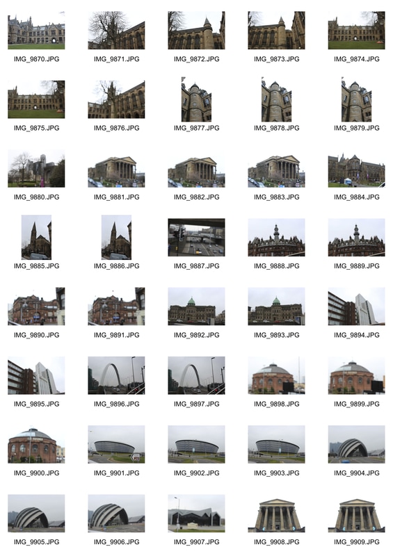
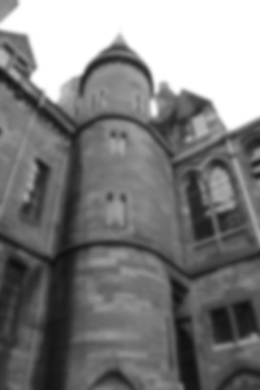
I really feel Sugimoto's work link to my main theme "Environment" and I decided to take it upon as my second strand. Visiting Glasgow for an Open day I found the perfect chance to photograph somewhere different than London. So I went around Glasgow and photographed some of the most popular landmarks of the city such as the Rotunda of Glasgow, the Glasgow Hydra, the Clyde Auditorium designed by award winning Foster and partners and even the University of Glasgow. I decided not to photograph only modernist architecture buildings but also other styles as this would expand the variety of my images. I tried to push my focal length as much as I could, differently for every building as they do not have the same detail or as many lines and edges each one of them. For example a building such as the main hall of the University with the many edges, windows and detail it needed less blurring as it would easily be dissolved. I mainly photographed the buildings from a frontal view and a distance enough to cover the whole building. After that I created my contact sheets and chose the best ones. I decided to turn them in black and white as I feel makes them more timeless, approaching Sugimoto's work and increase the contrast and tone at the edges to make them more distinct.
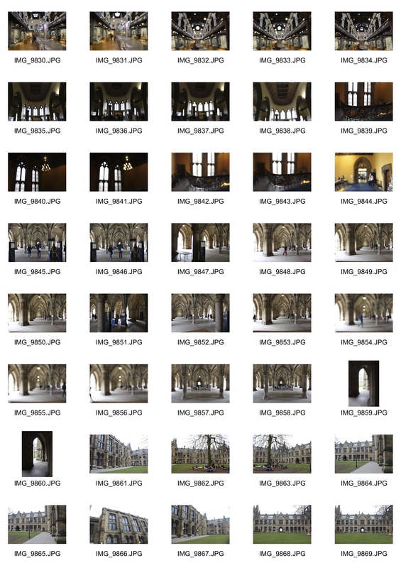
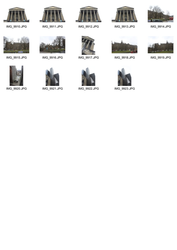
|
|
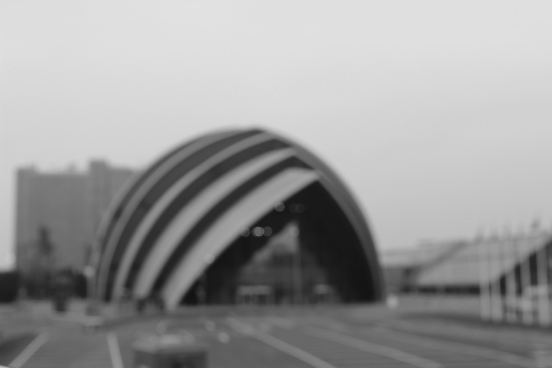
WWW: I feel that my images approaching the initial idea, of pushing the limits between the known and the unknown and I like the result of the blurred and black and white. I tried to take images of as many modernist and non landmarks and from different perspective.
EBI: I think that by expanding my ideas and moving on from the buildings, having a greater variety of blurred objects around us would be suitable for the purposes of the project.
EBI: I think that by expanding my ideas and moving on from the buildings, having a greater variety of blurred objects around us would be suitable for the purposes of the project.
3rd Strand
Miniature Photography - Slinkachu
Slinkachu is a British artist born in 1979. Born Stuart Pantoll, he changed his name in to the artistic "Slinkachu" to keep his identity as much hidden as possible. As he says, " I was always interested in small things ", and when his dad made him a train station miniature set as a child he recalls that he was not interested in the train at all but in the small things like the figures and the trees. At the age of 23 he move to London to pursue a career in commercial art and design. After four years, in the need to find a way to express himself more artistically, he bought small figures from eBay and started placing them in different locations, setting each time a new "toy-world" coexisting with our reality. The "Little People" project as he named it, is a long lasting project up to date and involves shooting in many different places around the world. Although the images seem easy to set up there is a long process behind these interesting images. First he buys the figures in web stores and repaints them and remodels them according to how he thinks they fit the scene. Some of his figures get new features and props like cloaks, suits, hats and so on. Then he places them as he wants using other materials form our everyday life and creates his scenes, a mixture of reality and surrealism. Once he sets up his scenes, Slinkachu ' shoots close-up, wide-angle images as well as pulled back scene to give a different perspective on his subject'. Sometimes it's tricky and exhaustive as he has to take around 300 images of the same set in order to get the perfect shot. And even then the work is not done. The process of selection which according to him is very important has to be taken seriously in order to choose the perfect angle and set. He then process the image in Photoshop in order to enhance the images and make them more realistic by toning them.
After Slinkachu finishes his street installations, he leaves them on pavements cracks, or near litter and in other random places to fend for themselves. In a cruel world of city-living, these Lilliputians convey complex narratives about human conditions exploring the way ordinary people live their lives in today’s consumerist society. Unfulfilled dreams, loneliness, a cry for friendships and freedom, as well as the over-dependence on the consumption economy that drives so many of our decisions are just some of the themes they explore. Nearly ten years after his first installation, Slinkachu's work continues to highlight the human feelings and emotions, and state of mind of everyday human life. These small worlds act as a reflection of real life situations, as the own creator of them is inspired by the world around him. Nowadays issues in the big cities such as loneliness and disconnectedness from the world is highly depicted in Slinkcahu's work, and are to be interpreted in different ways by the viewers.
My Response:
For my response to the artist I borrowed miniature figures from the Photography lab around 30 of them and went around school trying to place them in different places setting different environments every time, to create an interesting set and photograph my figures from different angles and perspectives. I high contrasted them as I think it looked better with miniatures and each time I used different figures placing them from a plant leaf or a keyboard to a stack of books. I wanted to show how these small figures coexist in our reality and our environment, thus placing them on things of our every day life instead creating a small miniature world. That coexistence of the "small" and the "big" - "real" world, which works as a reflection of one another is what I found interesting in Slinkachu's work and I think is suitable for this project. One of my major differences, which I think is notable to point out is that through my images I did not express loneliness or isolation from the outer world, by using one figure in different situations, something which is highly common in Slinkacku's work.
WWW: I feel the images represent clearly the idea of miniature photography, and I also like the high contrast and focus on the figures which is my main subject. I placed my figures in places which I found creative conceptually with the figures and explored different perspectives of photographing them.
EBI: Firstly I think that the remodeling and repainting of the figures would enhance my images and by drawing eyes and facial expression on the figures would make the images much better. Also a bigger variety of miniature figures, as I had a limited number of them, would expand my ideas and create more interesting sets. The last thing I think I could improve and focus on more is depict social and environmental issues which are highly depicted by Slinkachu and I think make the work more substantial and interesting, such as social isolation, domestic violence, pollution etc.
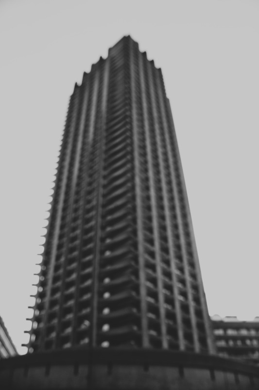
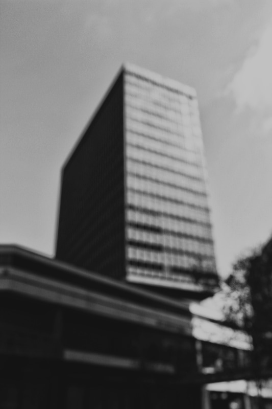
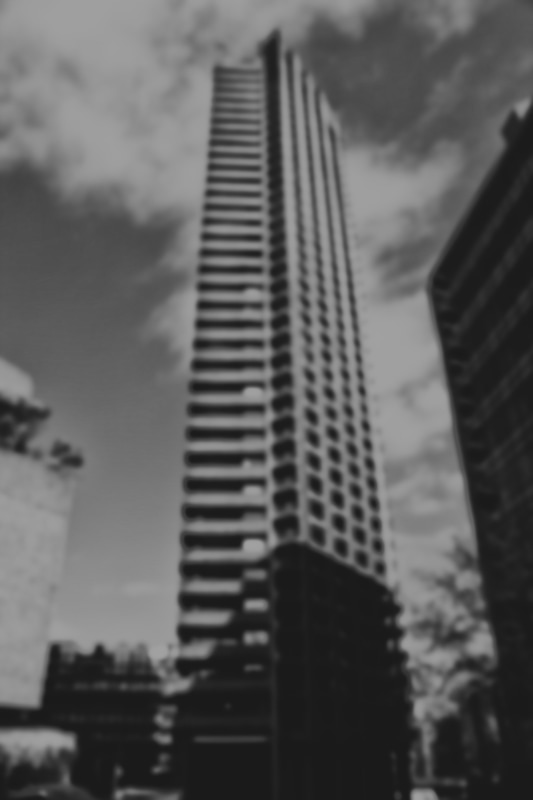
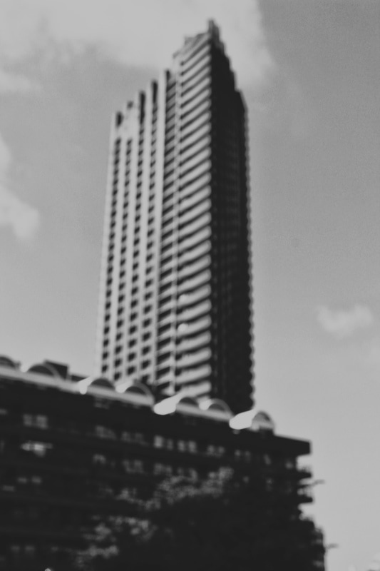
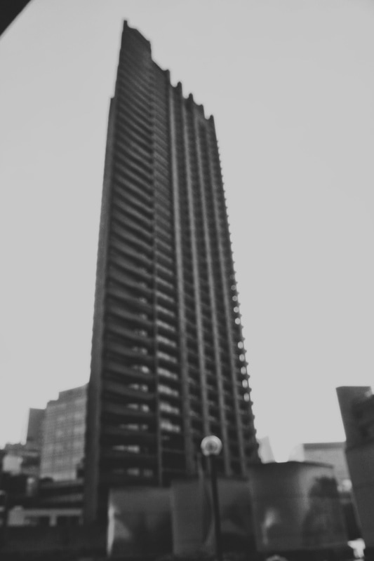
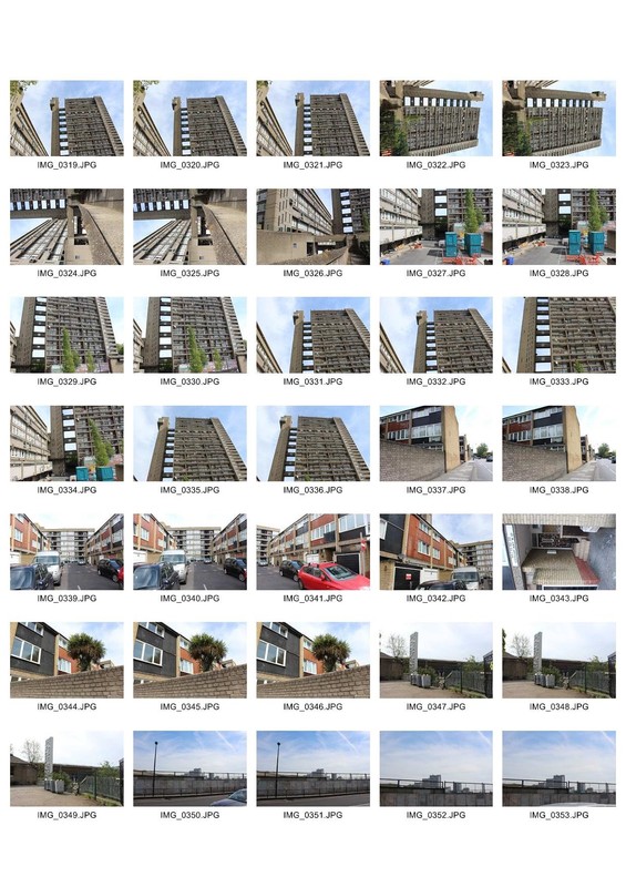
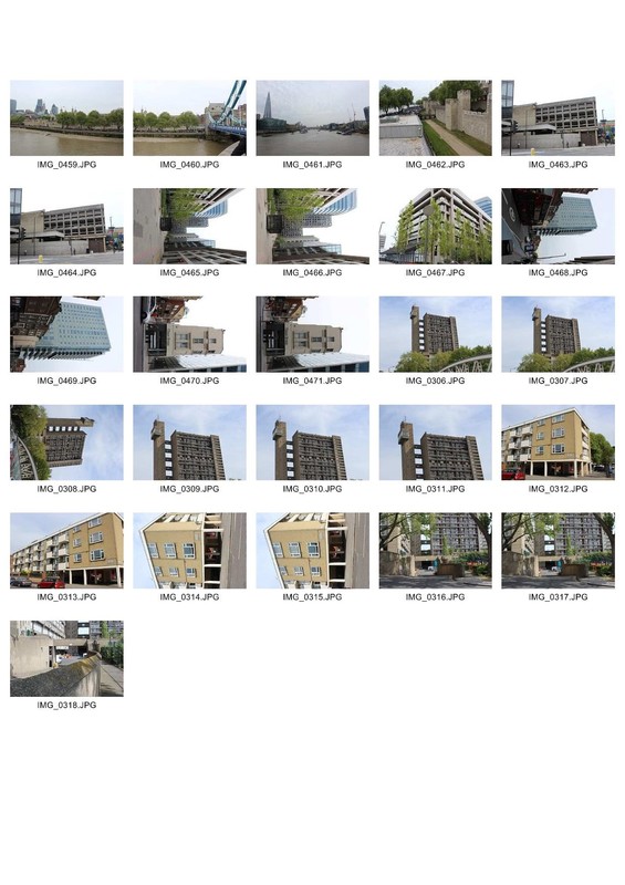
Development 1 - Brutalism
Brutalist Architecture : Brutalist architecture is a movement in architecture that proliferated from the 1950s till the mid 1970s all over the world. The word "Brutal" comes from the french word for "raw" and was initially used by Le Corbusier to describe the material from which the buildings where made, "Beton Brut". The detailed raw concrete and massive structures used for governmental and institutional clients is the main feature of Brutalist Architecture.
In its ruggedness and lack of concern to look comfortable or easy, Brutalism can be seen as a reaction by a younger generation to the lightness, optimism
Linking it to the theme of the project I felt that the exploration of brutalist architecture suited me more and in the near future I would be more creative in developing my project.
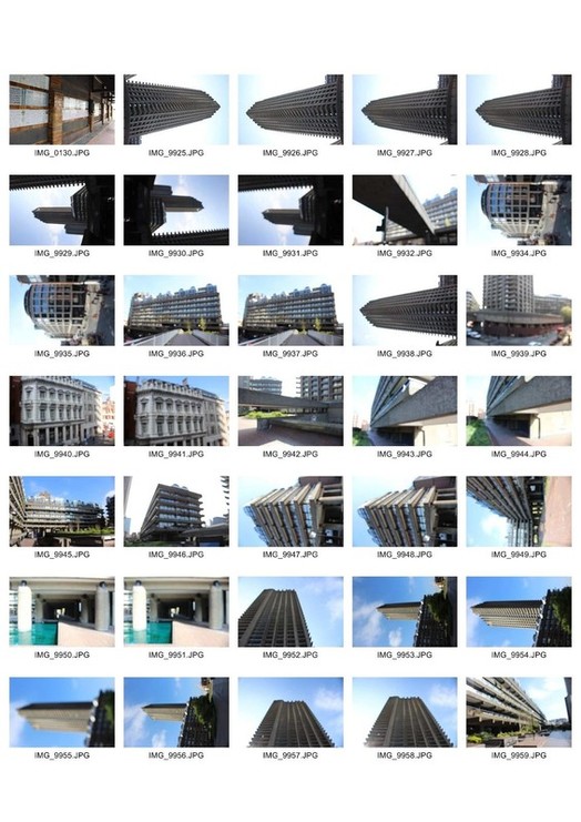
To continue on my project I decided to develop the second strand I did which is the blur and great depth of field. I decided to include in my pictures brutalist buildings and use a great depth of field. So I visited Barbican which is famous all around the world for its brutalist grey structures and photographed with my camera. I included images of other buildings form around the area which I found suited my theme. I tried different angles and perspectives and experimented with different depth of fields. The day was sunny so I used low ISO. My images are a bit overexposed as in some of them I am looking up the buildings opposite the sun.
In its ruggedness and lack of concern to look comfortable or easy, Brutalism can be seen as a reaction by a younger generation to the lightness, optimism
Linking it to the theme of the project I felt that the exploration of brutalist architecture suited me more and in the near future I would be more creative in developing my project.
To continue on my project I decided to develop the second strand I did which is the blur and great depth of field. I decided to include in my pictures brutalist buildings and use a great depth of field. So I visited Barbican which is famous all around the world for its brutalist grey structures and photographed with my camera. I included images of other buildings form around the area which I found suited my theme. I tried different angles and perspectives and experimented with different depth of fields. The day was sunny so I used low ISO. My images are a bit overexposed as in some of them I am looking up the buildings opposite the sun.
|
|
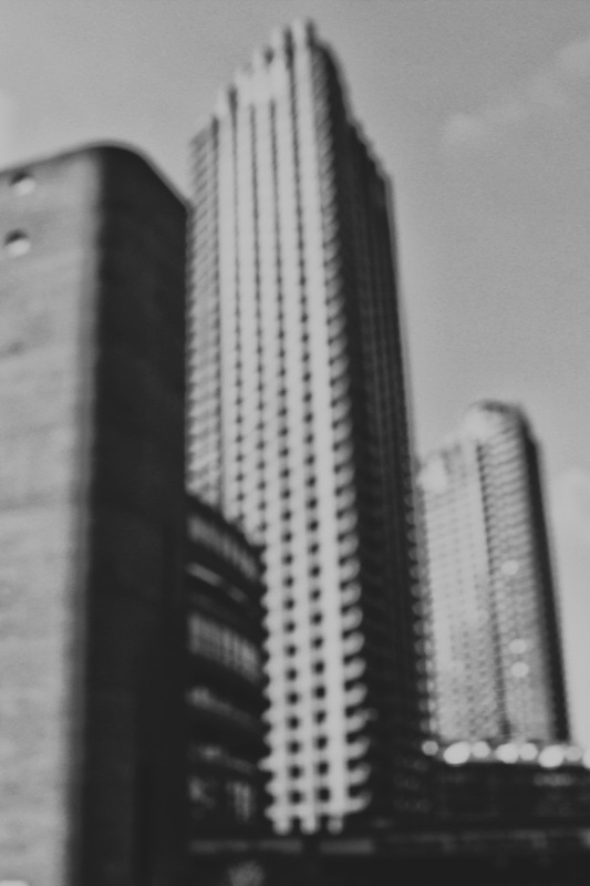
After the photoshoot in central London, I chose my favourite images, and turned them in black and white in Photoshop. Then I increased the contrast and the gamma correction and decreased the exposure, to make the shapes of the images more clear as they were faded due to the great depth of field and bright and sunny day. I think that the great depth of field in my images serve the purpose of removing the details and leave only the necesseary and essential information, which make subject recognisable. Also I use black and white because I want to make my images chronologically unrecognisable. Thus I also try not to include and cars or humans which could place the images somewhere specific in time.
For the same development I chose and croped the images that included only tall buldings and created six portraits. I really like the symmetry in my images and the pattern of the windows. After I porcessed my images in Photoshop, I used the Nik Collection filters by Google to create these vintage effects. The purpose of this was to make them look around a century old and bring them back to the origins of brutalim around the 1920s.
For the same development I chose and croped the images that included only tall buldings and created six portraits. I really like the symmetry in my images and the pattern of the windows. After I porcessed my images in Photoshop, I used the Nik Collection filters by Google to create these vintage effects. The purpose of this was to make them look around a century old and bring them back to the origins of brutalim around the 1920s.
|
|
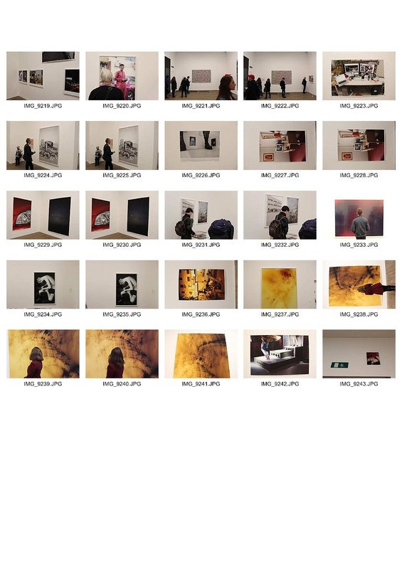
Exhibition Visit - Richard Mosse -- Incoming
As part of the exam project, I visited on the 7th of April an exhibition by photographer Richard Mossed called "Incoming", in Barbican Centre.
Richard Mosse is a conceptual documentary photographer born in 1980 in Killkenny, Ireland. He received a BA in English Literature from King's College London, a Postgraduate diploma in Fine Arts from Goldsmiths University of London and a photography MFA from Yale School of Art. He has worked and travelled all around the world, and is best known for his infrared images form the Democratic Republic of the Congo.In 2014 Mosse received the Deutsche Boerse photography prize for his work Enclave and in June 2015 he became a nominee member of Magnum Photos.
In the current exhibition name "Incoming" Richard Mosse with the help of the cinematographer Trevor Tweeten, use a military camera, made in the EU, which can detect thermal radiation from a distance of up to 30km away, and is used for military awareness and border control, to document the refugee crisis from a different perspective. His collection includes photographs and small length films, taken in Syria, Lesvos and the "Jungle" in Calais. He usually stands hidden at the top of some hill and with his small crew, they document the life in the refugee camps. This camera alienates the faces of the people in the images, making them unrecognizable, as it would be illegal and for that he faced some trouble in Syria as the access with this camera would be considered weapon smuggling.
What I found very interesting about his current work and some previous body of work is that he uses a medium of photography which allows him to document important events, through a different angle and perspective. He does not remain to the normal documentary photography using a simple camera but tries to find interesting and new ways to photograph, such as the aerochrome film in Congo, and now the military camera in the refugee camps. It does not directly link to my strand and development which is documentation through blur and increased depth of field, but in terms of a different way to document and event. Thus I found it very interesting to link it to my project as both the blur I use, and the military camera, estrange the main characteristics of the subjects which are not important to the viewers and leave only the important and contextual details.
The exhibition was not that big, it was all in one big spiral corridor with 3 big screens, one smaller and three large printed images. The lights were off and the walls of the corridor were black. The space was kind of big and tall and huge speakers were all around the room producing the sound of the videos that were playing form the refugee camps, from the voices and sound around the camps. The first feelings and thoughts are kind of strange as you go through the corridor, as the videos on the screens seem like war video games and seems like someone is spying on their every move, but you realise these are actual people staying in terrible conditions in those camps. From my personal experience of visiting the Calais Refugee Camp, seeing the horrible conditions these people live, having left their homes and travelled thousands of miles to find a new home and a better future, and being unable to do so, this exhibition brought back so many memories. Seeing footage filmed in the island I lived, Lesvos, which is the passage of nearly all the immigrants in the EU, showing boats filled with people trying to get form Turkey to Greece in these conditions, and in the way of this, so many people and children being lost, created a strange feeling of both sadness and anger.
|
|
|
In the exhibition as the photographs and filming were allowed, I decided to document my way through the exhibition not only in images, but by filming some of the video footage. I did not have enough capacity in my memory to film long lasting videos, but i think these are e good example of the footage in the exhibition. I felt that this is a more direct way rather than just images and can reveal more about the content of the exhibitions. I specifically chose the last video to film, as it shows the very common thing people do trying to cross over form Turkey to Greece, on inflatable boats, which is to destroy them with knives a bit before they arrive on the coast of Greece, literally leaving themselves on the cold water especially during the winter, and sometimes even dying from this. This way they are saved by the authorities and given a shelter but so many innocent live are lost during that process. After I took the videos I uploaded them in YouTube in high quality and then on the website.
Development 2
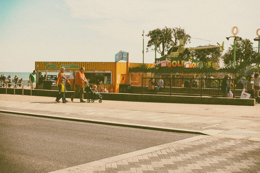
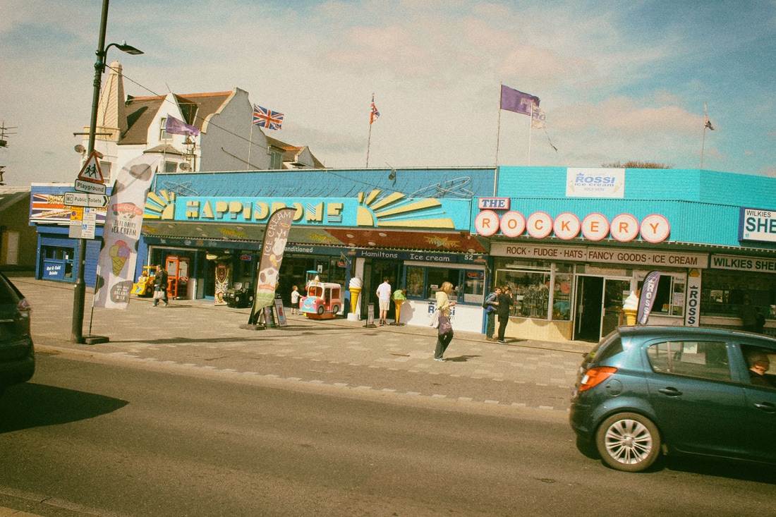
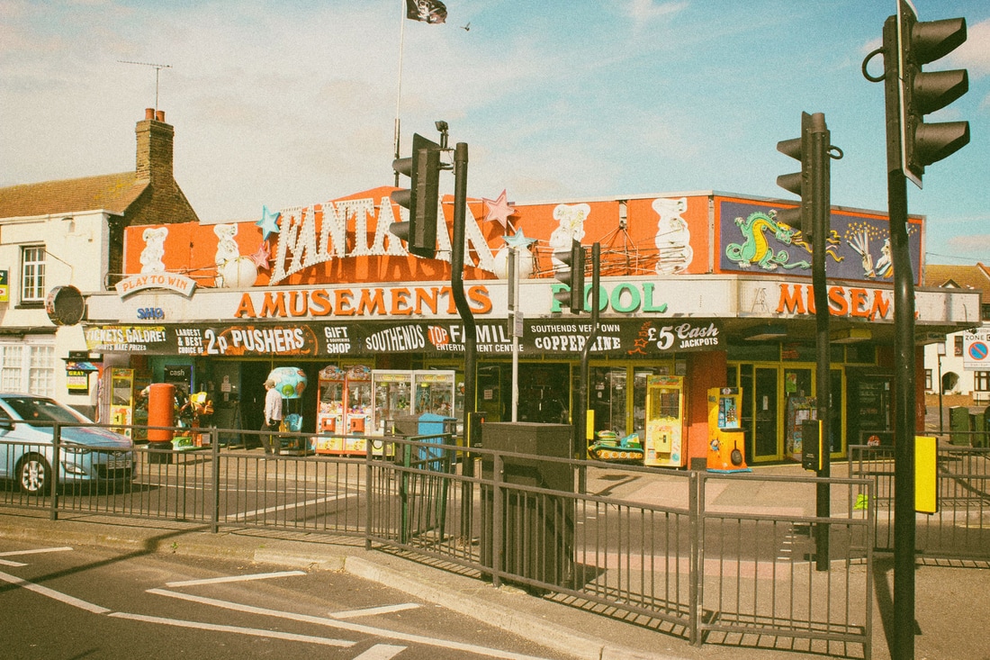
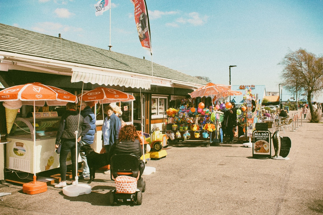
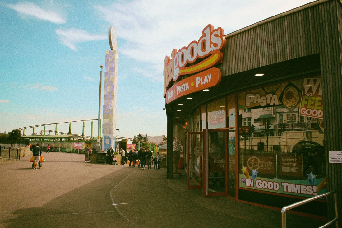
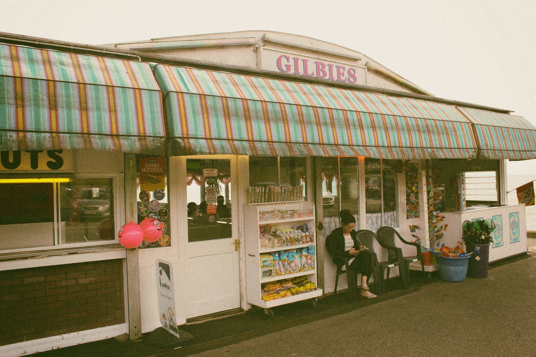
Artist Link - Martin Parr
For the second development I decided to decline a bit from the idea of brutalism and use the depth of field and colour to bring my images back to he 1980s.
The perfect chance for this development was a trip I took during a sunny day in Southend-On-Sea, one of the most famous seaside resorts in England. As most
seaside resort in the UK Southend rose to fame during the 1980s an era where the English middle class masses would fill, by thousands, the seaside resorts during the sunny weekends. This era is highly depicted in the classic Martin Parr's book "The Last Resort" which includes a series of photographs taken in New Brighton from 1983 to 1985. The images of Martin Parr revive the exact atmosphere of the 1980s and the vintage colours and tone take us 40 years back. Parr photographs during daylight and also has a few night shots.
The Last Resort – was an intimate freeze-frame of New Brighton, a time capsule of the holidays working class families during Thatcher’s reign. Shot in colour during a time where traditional black and white imagery was the exclusive medium of ‘proper’ photography (a trend first dismantled by Americans like Stephen Shore and William Eggleston before Parr brought it across the Atlantic),
The moment I arrived at Southend I was surprised by how exactly the same the shops and the main street of Southend has been preserved throughout the years. I looked up images on the internet of how the resort looked forty years before and the result is exactly the same. Even the frontal of the shops and the arcade games had remained the same. And the is exactly what i wanted to depict in this development: how the environment around us remains either the same or changes slightly throughout the years but the people are the ones who change. Some could argue, about this statement with argument of the rapid development of technology and the structural changes, but this is not the case for Southend.
Instead of focusing on taking pictures of the people, I gave emphasis on photographing the shops and the main area along the plaza. To enhance my images I created these effects in Photoshop by changing the light and changing the hue and saturation and adding grains. I also used Adobe Lightroom which is better when it comes to lighting and colour effect and finally the Nik Collection to increase the vintage tone of my images. I was very satisfied with the result as it is very persuasive of the time they are supposed to take place, except from some where nowadays cars and other elements of the technological development.
|
|
For further development, I chose another set of the images I took, added shape blur and grains and used multiple layers by moving each one of them up and down and changing the opacity to create this vertical and horizontal movement. The purpose of the blur on these images was to create a time confusing effect as the colours and the tone, trick the viewers mind into thinking of 1980s but the blur removes the essential elements which make the image recognizable in time and place. At the same time it is not too much blur so that the basic shapes and forms cannot be recognized and the subject remains unidentifiable.
WWW: I like the time confusing effect i created with the blur in this development and result of my images and I think they transfer the message of their purpose. I think the right manipulation of the right elements such as Photoshop and Lightroom made my work more convincing and successful.
EBI: On the other hand I feel that my ideas on this development involving further progress are limited, as well as my resources are. I realised that I like working on black and white and on photographing brutalism as I prefer urban spaces and manipulating a bit more abstract subjects.
EBI: On the other hand I feel that my ideas on this development involving further progress are limited, as well as my resources are. I realised that I like working on black and white and on photographing brutalism as I prefer urban spaces and manipulating a bit more abstract subjects.
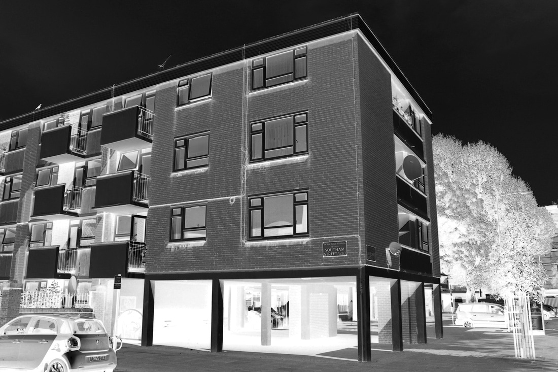
Development 3
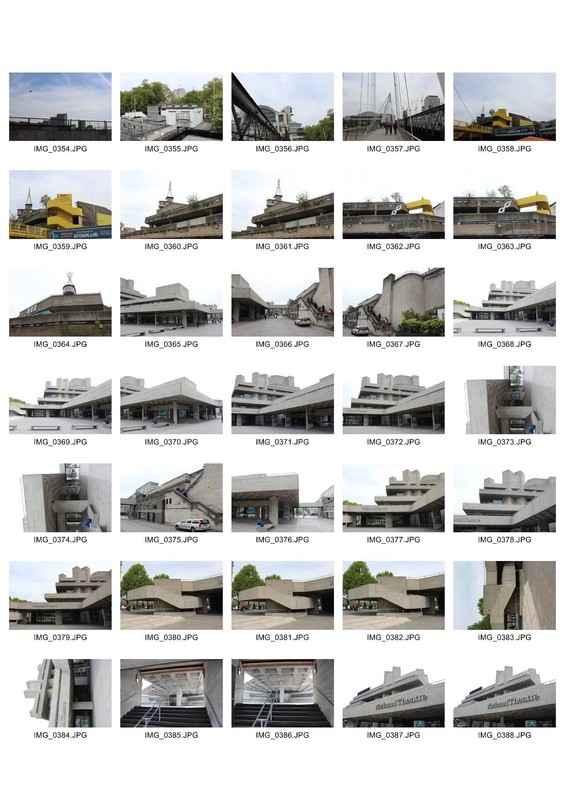
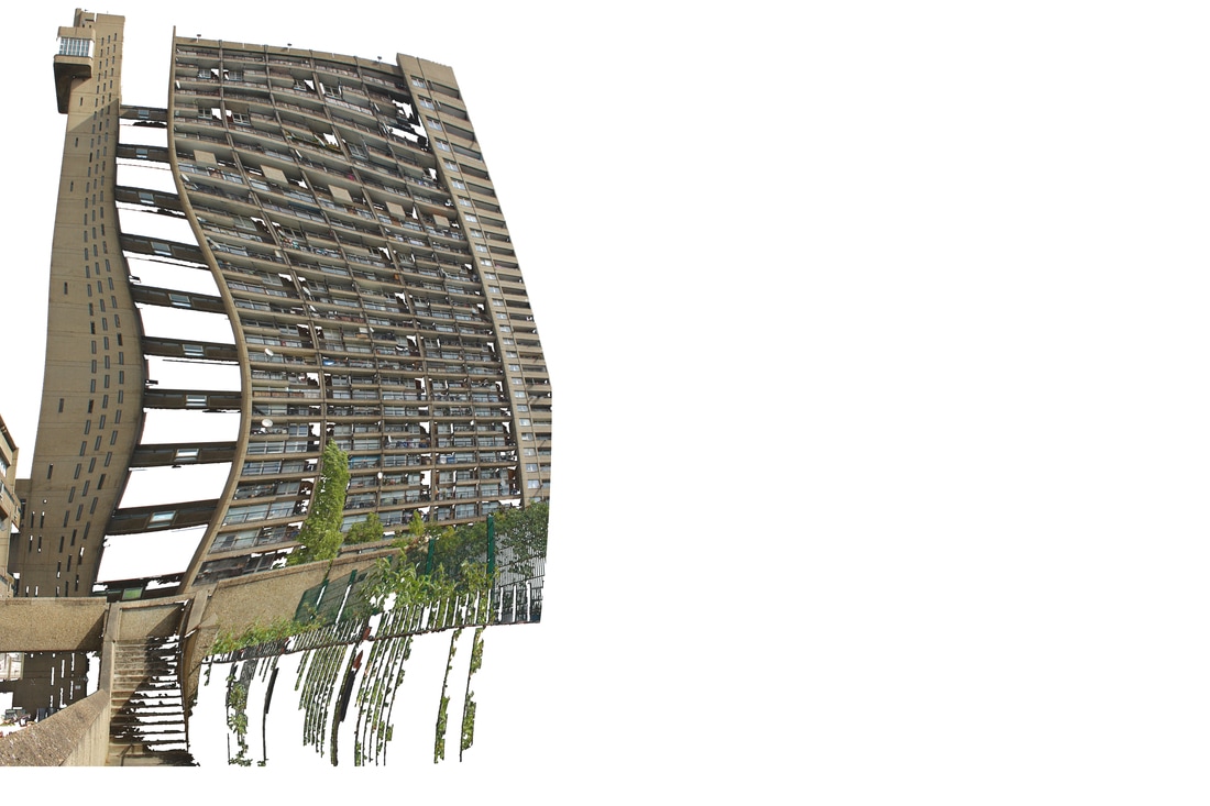
As I did not feel that the second development suited my project although the images depicted the message I wanted to provide, I decided to stick with the final idea which was Brutalist architecture with artistic methods and abstraction. For that purpose I continued my research on brutalist and slight of modernist architecture considering different guides for brutalist buildings around London. So for this development I visited Trellick Tower and National Theatre and the area around it in the Southbank. I went on a rainy day so the sky was kind of dark and the the buildings were shadowy.

|
|
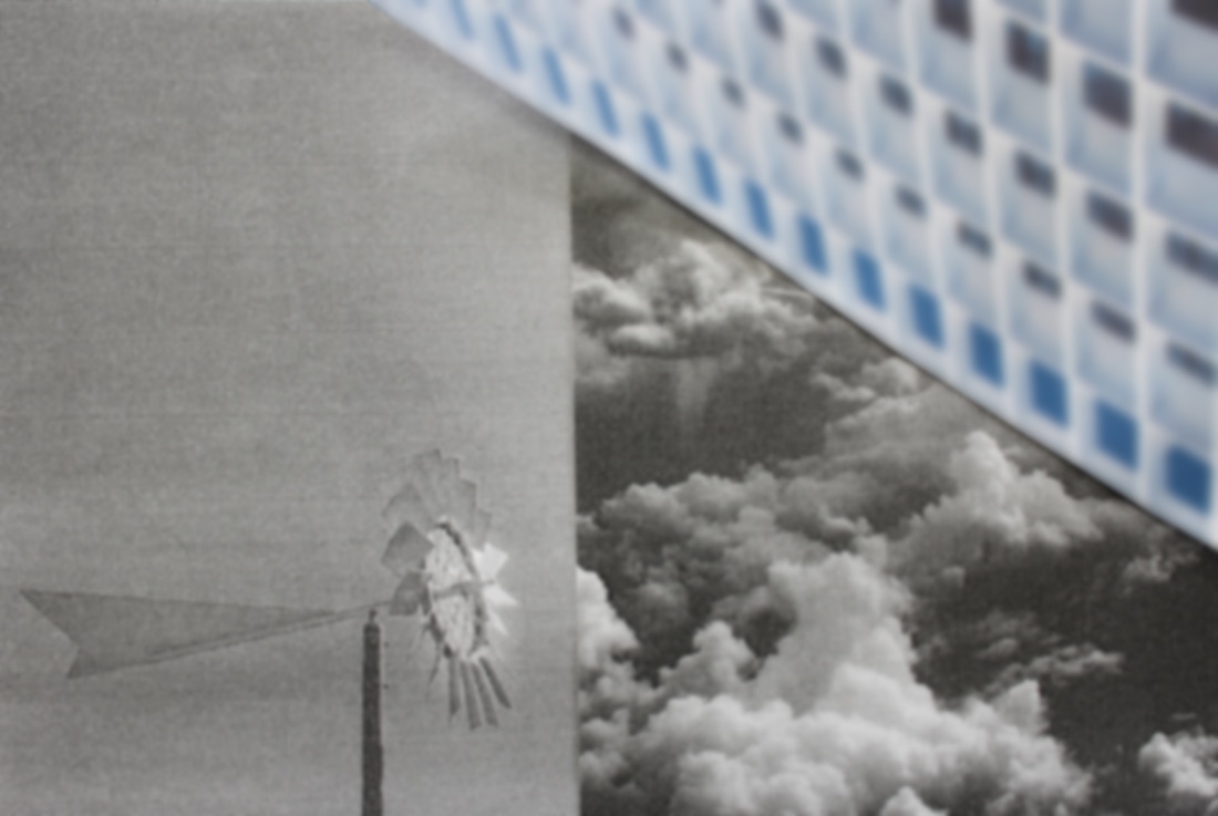
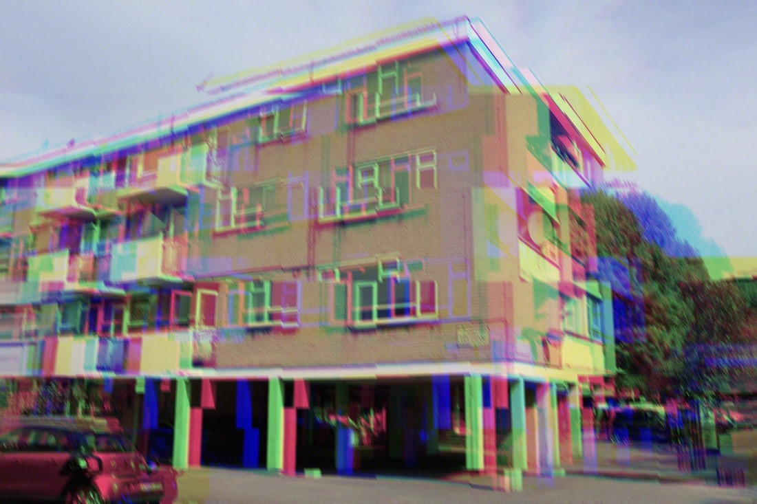
I used a great depth of field in my images which was increased in Photoshop as the abilities of my camera are limited and used different kind of blurs to create different effects. I then turned my images in black and white before increasing their contrast, and inverted them creating an effect similar to Richard Mosse's. I really like the effect of my images as they are in black and white the inversion effect makes aesthetically more attractive in my opinion.
This was my favourite image I edited. I combined the inversion technique and multiple layers shifting every time the initial image and using distortion filters creating this smooth movement. I really like how the dark parts of the images became dark and inverted and the light comes from the middle of the building but at the same time the transition to the dark parts is tranquil and smooth. The shape of the building can be seen but the building itself is pretty distorted and the abstracted form in black and white had a really good result. I think that this development was the most successful as I really liked the combination of the abstract with the brutalist architecture and the soft tone but at the same time distinct tone of the images. I was really satisfied with the result of the majority of my images, and for my next development I want to experiment with glitch techniques on different channels and maybe use colour combined with black and white.
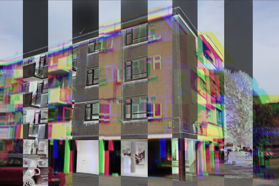
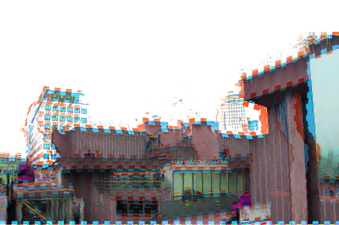
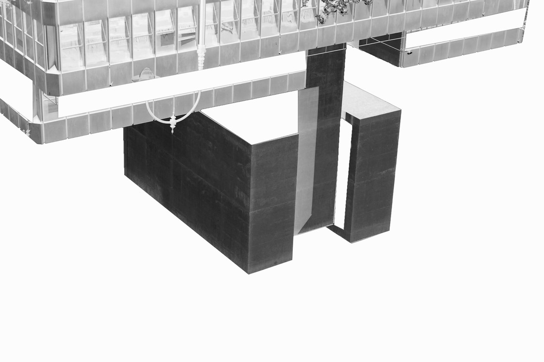
Development 4
For my fourth development I went to photograph Trellick Tower and the ares around Ladbroke Grove. Trellick Tower is an great example of brutalist architecture and the building apartments in the area kind of felt brutalist style. The raw concrete walls of simplistic and schematic architecture is what makes the very suitable for my project. I was looking for buildings that are simple with straight lines and ages and sequences like many windows and without many colours.

|


|
For my images I combined channel glitch with inversion and high contrasted multiple layers. I also used distortion filters and high saturation as I felt the result suited the brutal an concrete walls of my buildings.
|
|
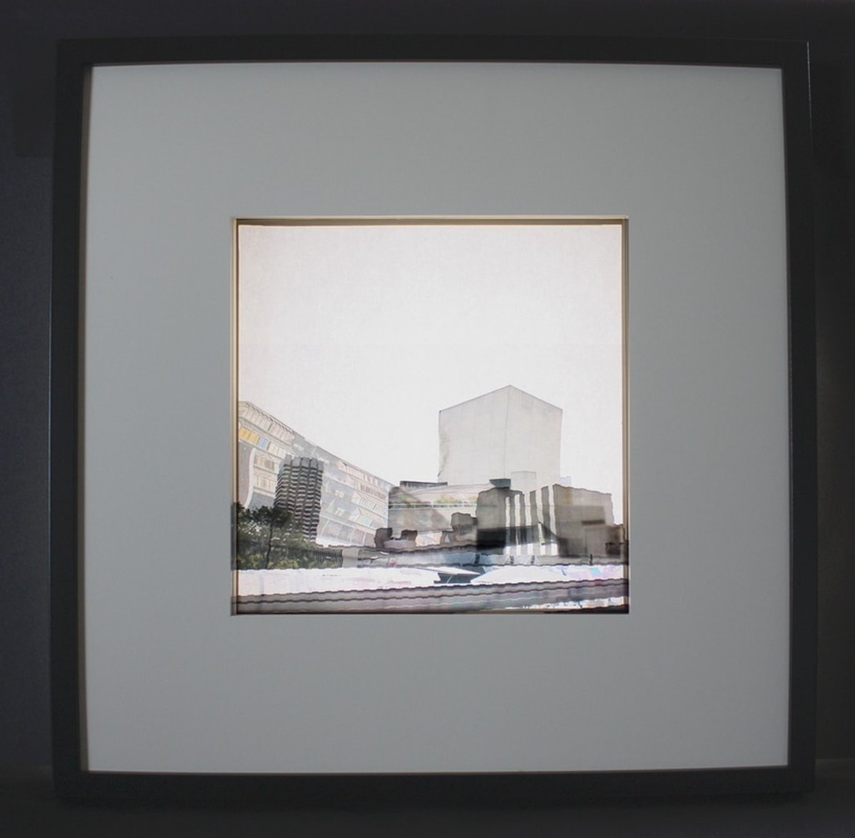
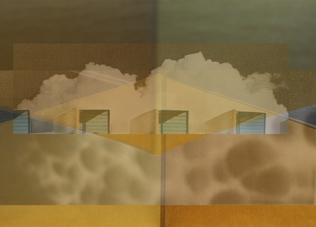
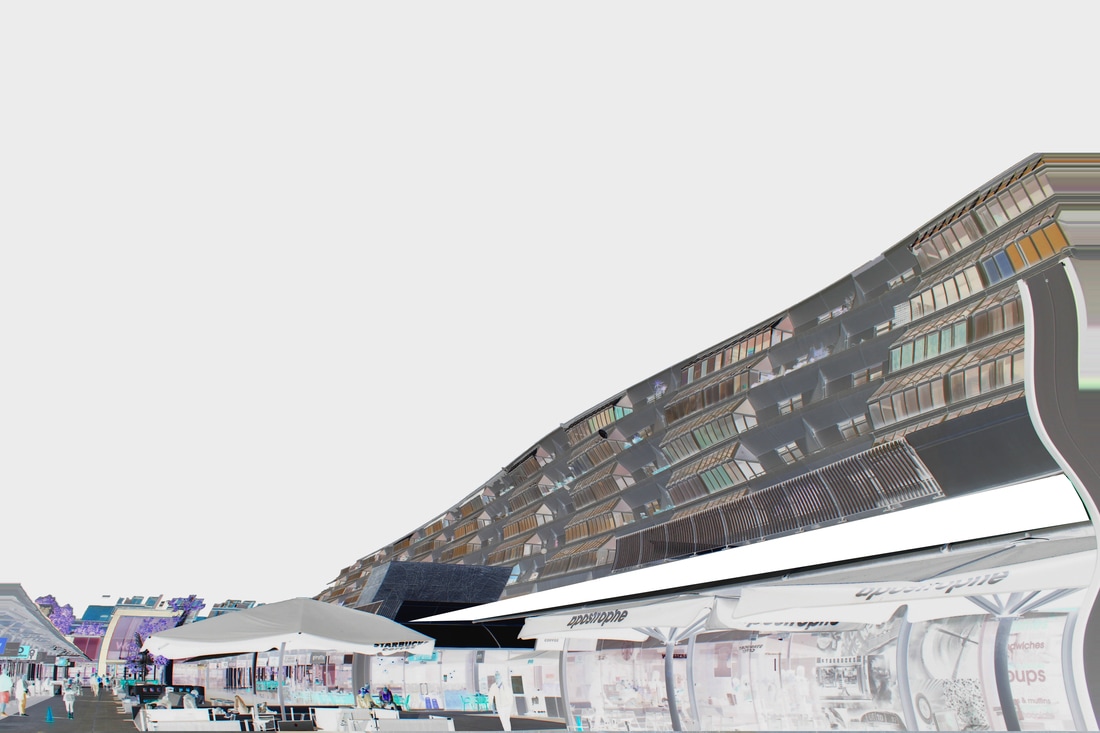
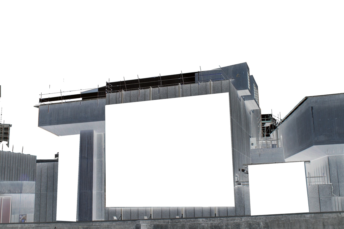
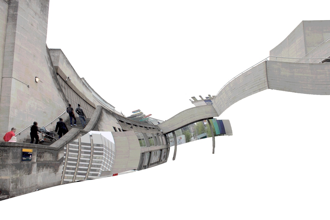
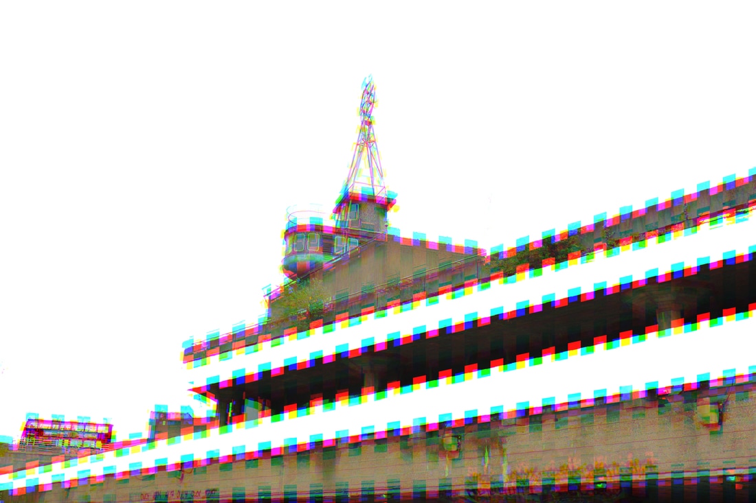
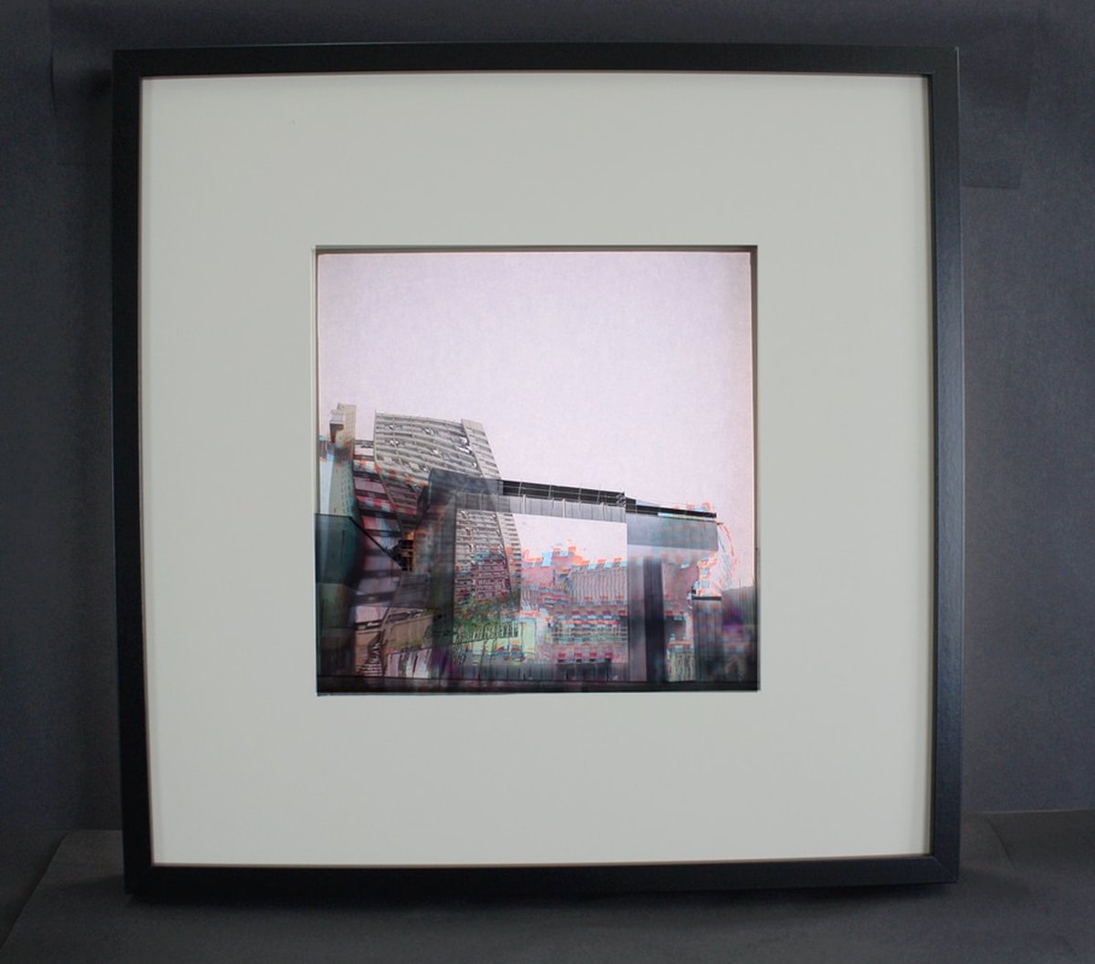
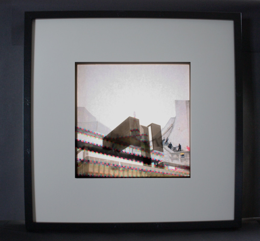
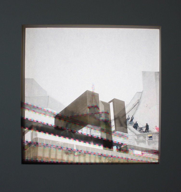
Final Development
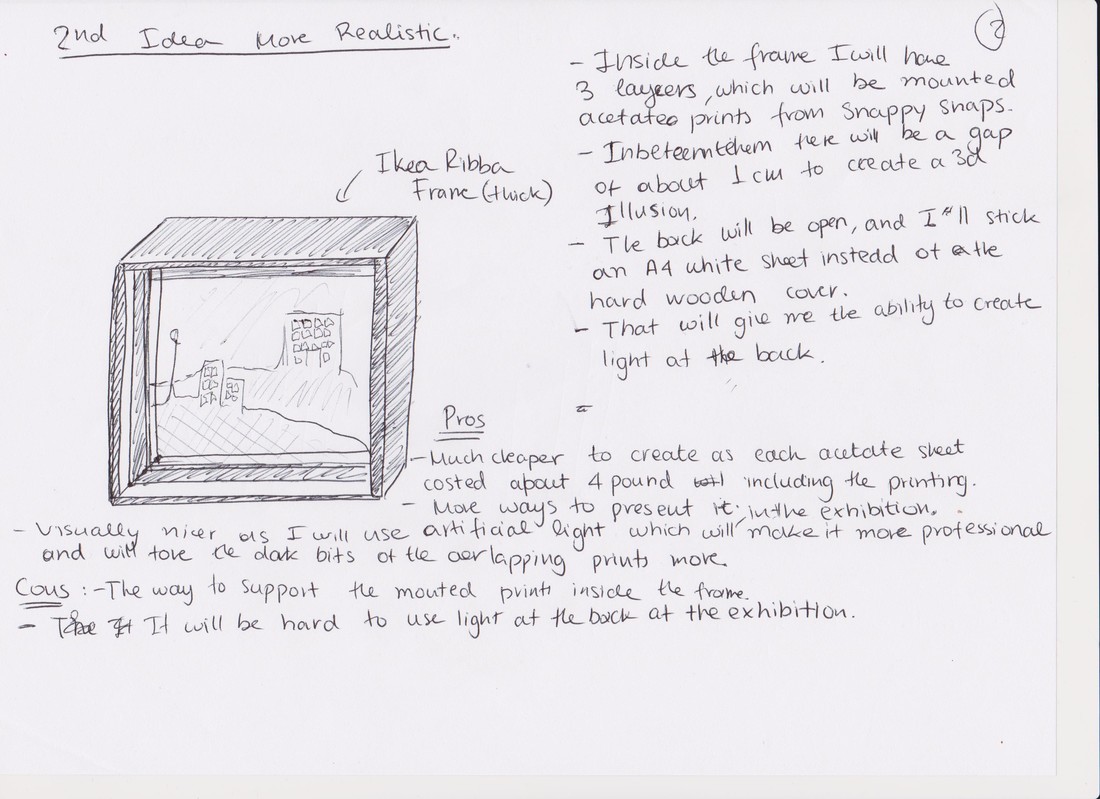
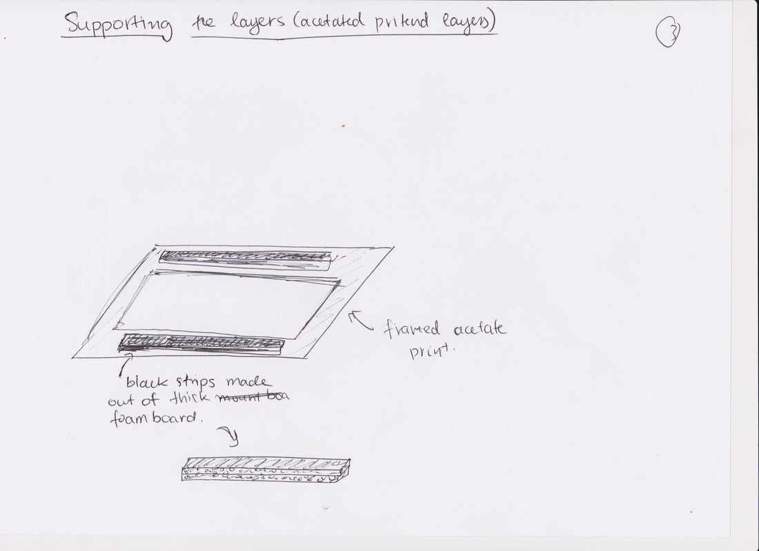
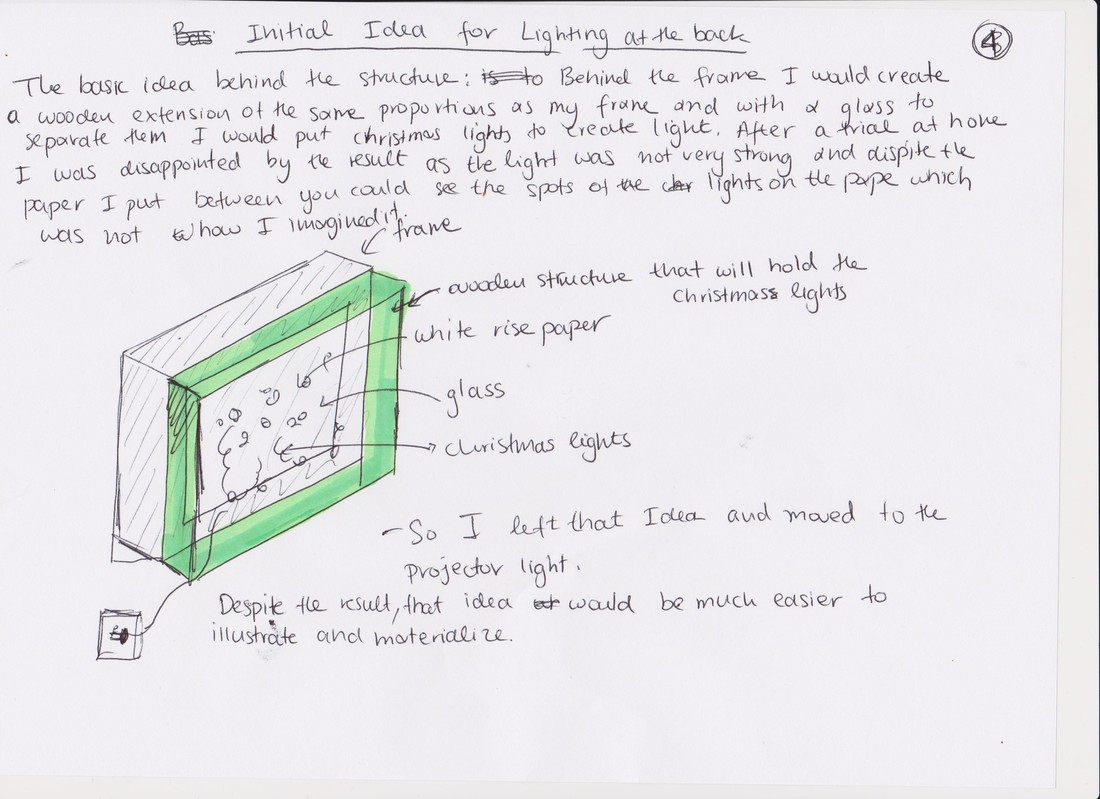
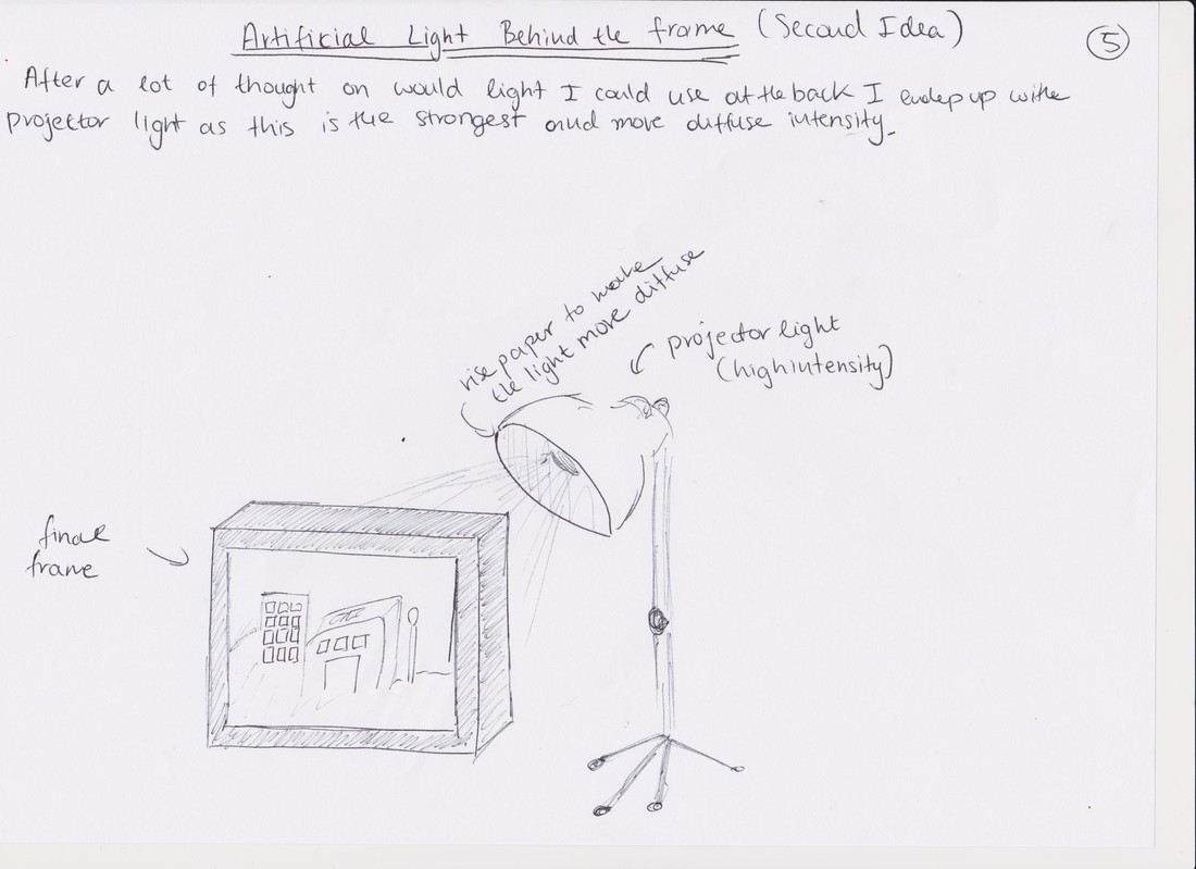
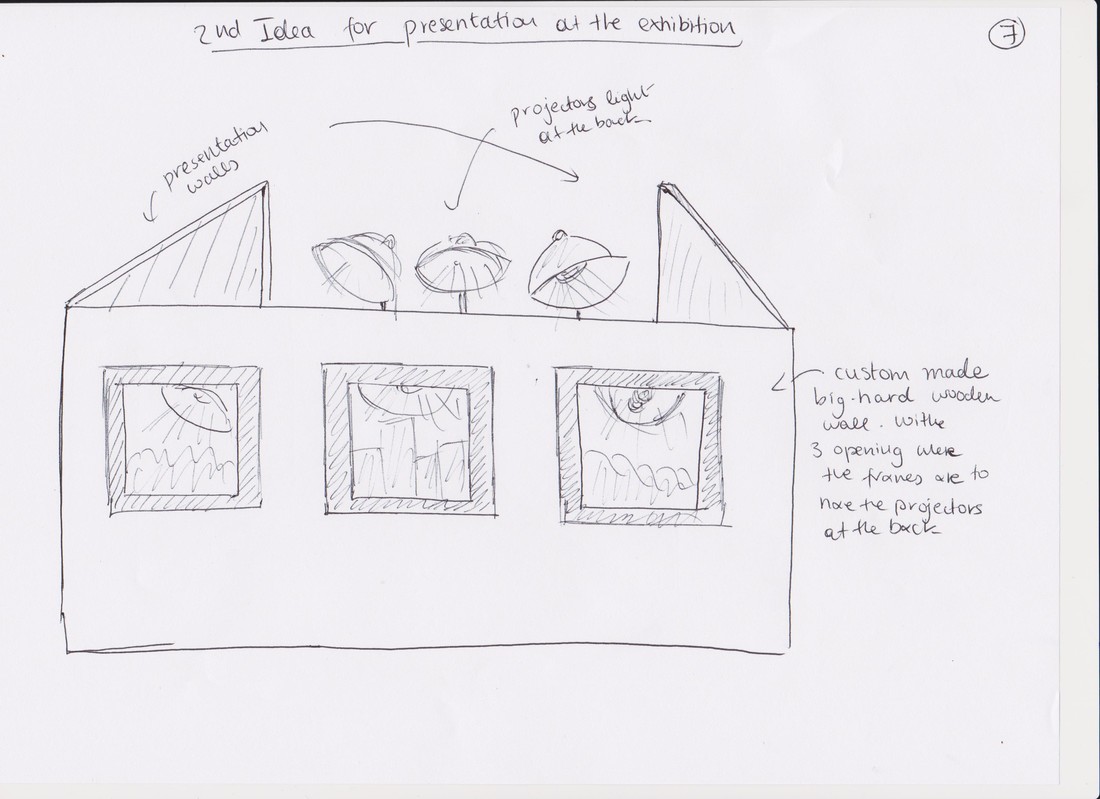
For the final development I decided to create 3d like pictures of distorted and glitched buildings, from images I took in the past developments. I printed my images on A3 size acetate clear sheets and used three images to create each frame. I created a fourth one which is a smaller size than the rest which I probably will not use in he exhibition. I decided to leave me images in colour as it was visually nicer and the result was great. I use inversion, glitch and blur with distortion in each image to create the 3d illusion. After I mounted and framed my images, I put white paper at the back on each frame and left it open without the hard wooden cover back so that I can use light and project it from the back. Below are a set of sketches I created with the initial and final ideas about the whole process of creating the frames, including how I am going to present it in the exhibition.
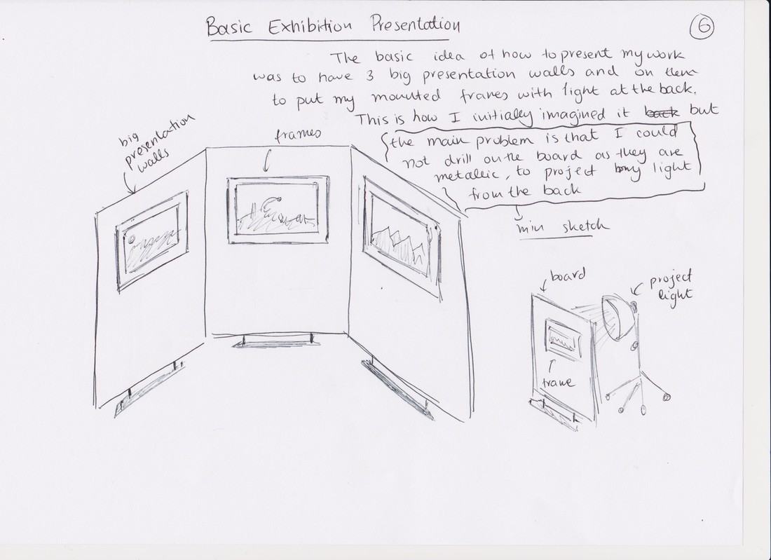
Frame 1
|
|
|
Frame 2
|
|
|
Frame 3
|
|
|
FRAME 1
FRAME 2
|
|
FRAME 3